Overview
Genesis is a community-based freight and moving platform designed to connect customers with independent transporters across Latin America, acting as a sustainable alternative to historically fragmented networks.
I owned and led the interface design for Genesis while the product was still undefined, translating an ambitious, largely unscoped vision into a usable, trustworthy platform — shaping the core user flows, the visual system, and the interactions that would hold the experience together as the product itself was still being figured out.
The final product vision evolved from an early concept into a complete, interactive booking experience supported by a robust component system, successfully establishing the foundation as the team prepared for development.
Context
The vision was massive, but the blueprint was a blank slate
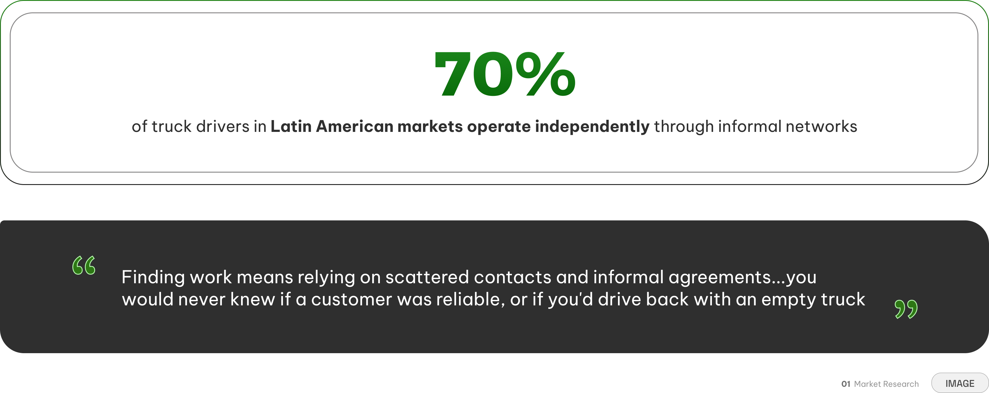
Across Latin America, independent freight and moving services often operate through informal, fragmented networks — word of mouth, scattered listings, and little to no way for a customer to verify who they were actually trusting with their belongings. Genesis set out to formalize that network into a single platform, connecting customers directly with independent transporters.
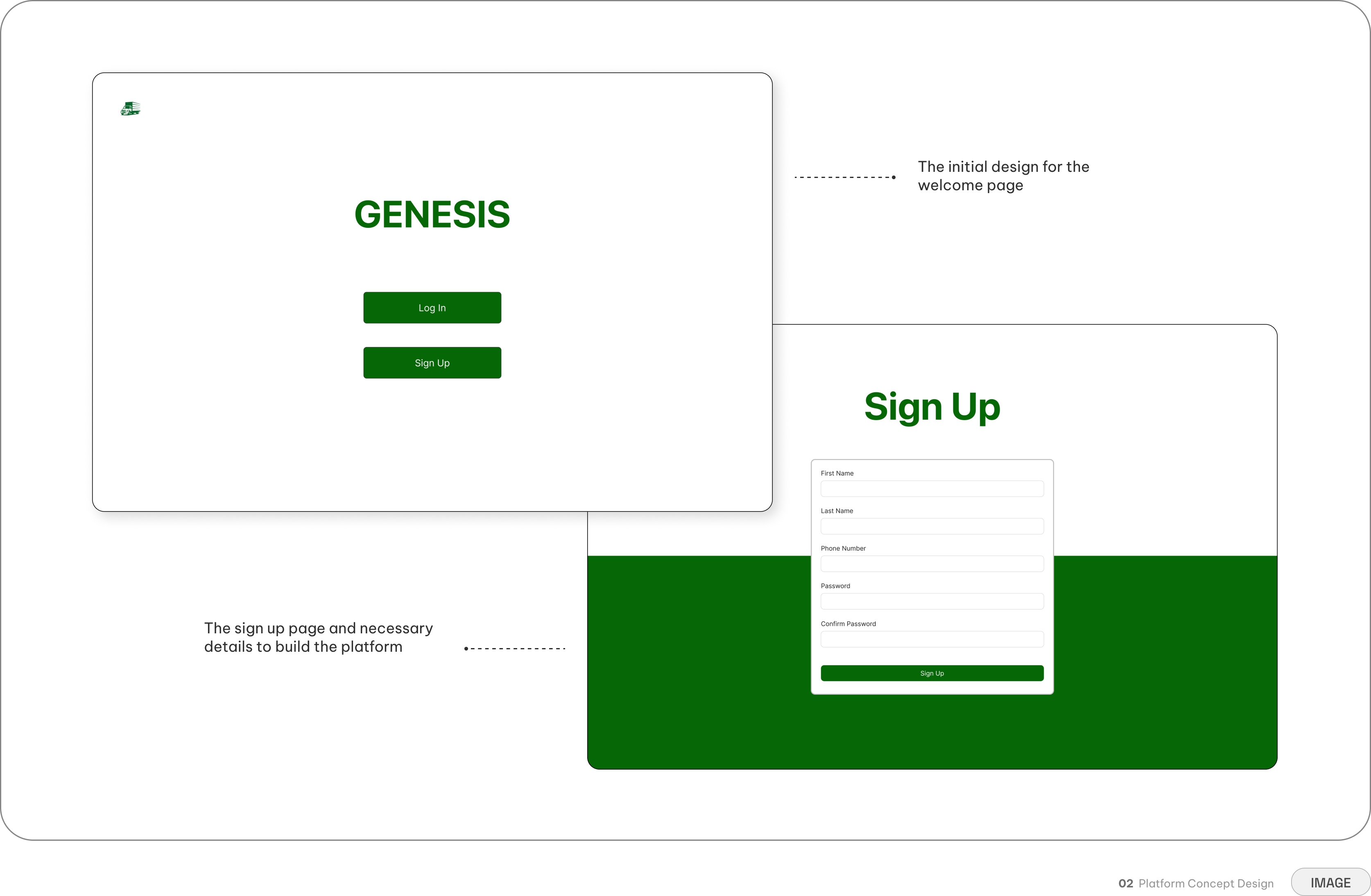
There was no existing product to redesign and no prior research to build on — just an ambitious concept and a small team tasked with figuring out what the product actually needed to be, from the ground up.
The Problem
How do you introduce complex logistics without being overwhelming?
Genesis needed to help customers coordinate an unfamiliar logistical process while eventually supporting an ecosystem of independent drivers across different regions, devices, and levels of digital familiarity.
The service itself was inherently complex. A single booking could involve locations, cargo limitations, vehicle selections and extensive communication on both sides. Exposing all of that at once would risk overwhelming users before they completed their first booking.
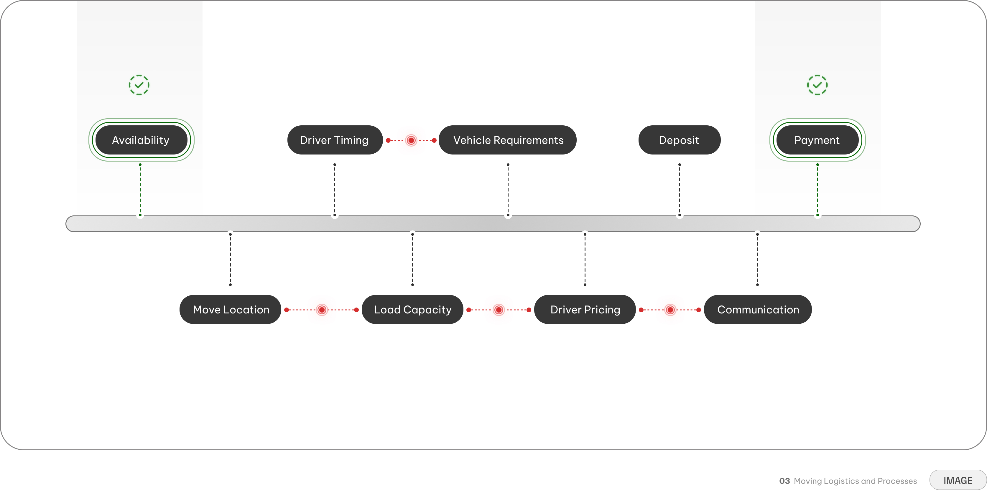
The market had plenty of drivers and customers, but operated through uncentralized networks
Users were already familiar with digital payments, so the core challenge wasn't the technology
Booking a move relied on the alignment of schedules and proximity for both parties involved
Users knew exactly what they owned, but struggled to understand what vehicle size they required
Rates fluctuated by vehicle, distance, and demand, but users just saw a final price with no breakdown
Arrival windows and handoffs had to be perfect, but coordination occurred as needed
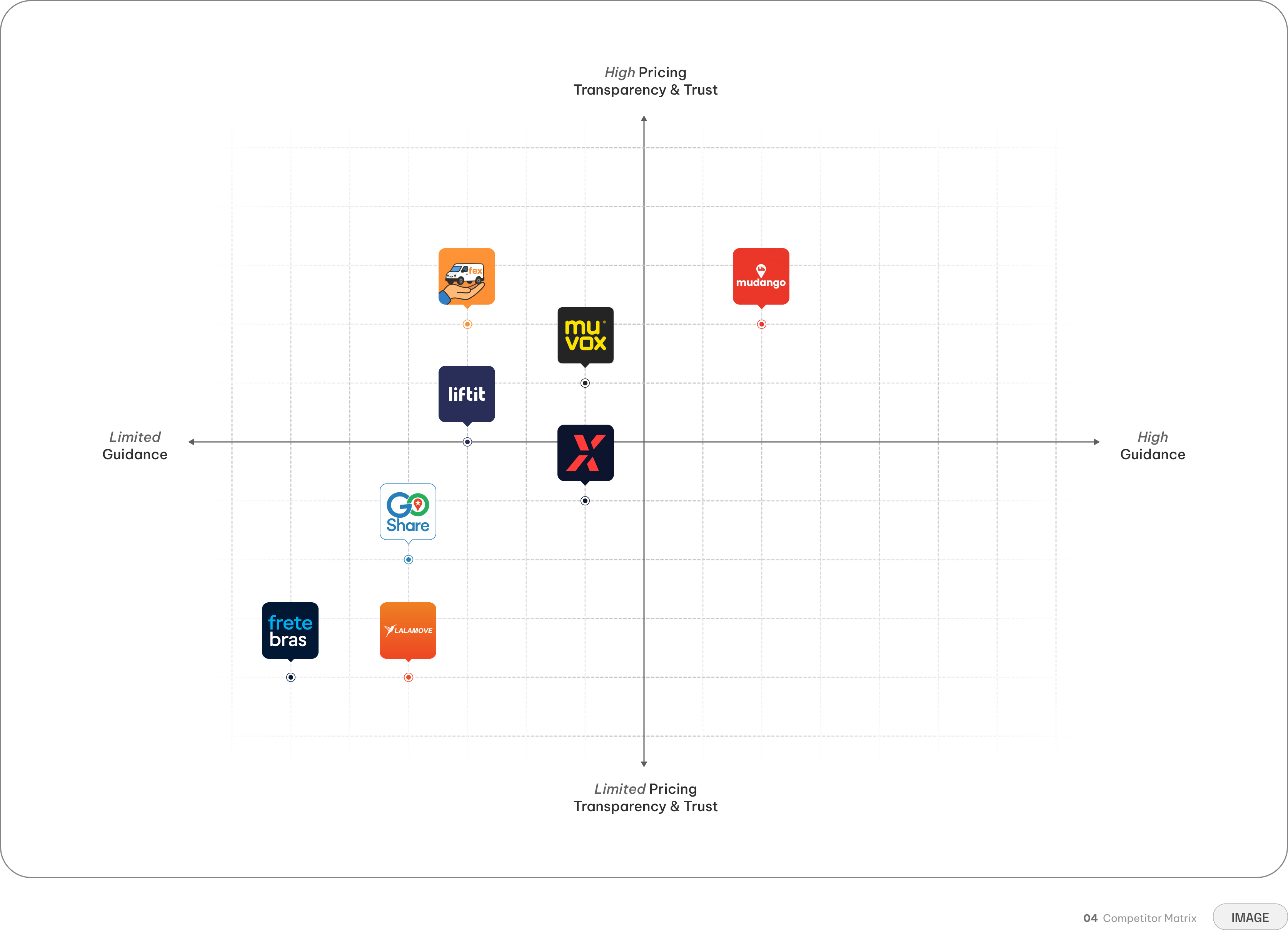
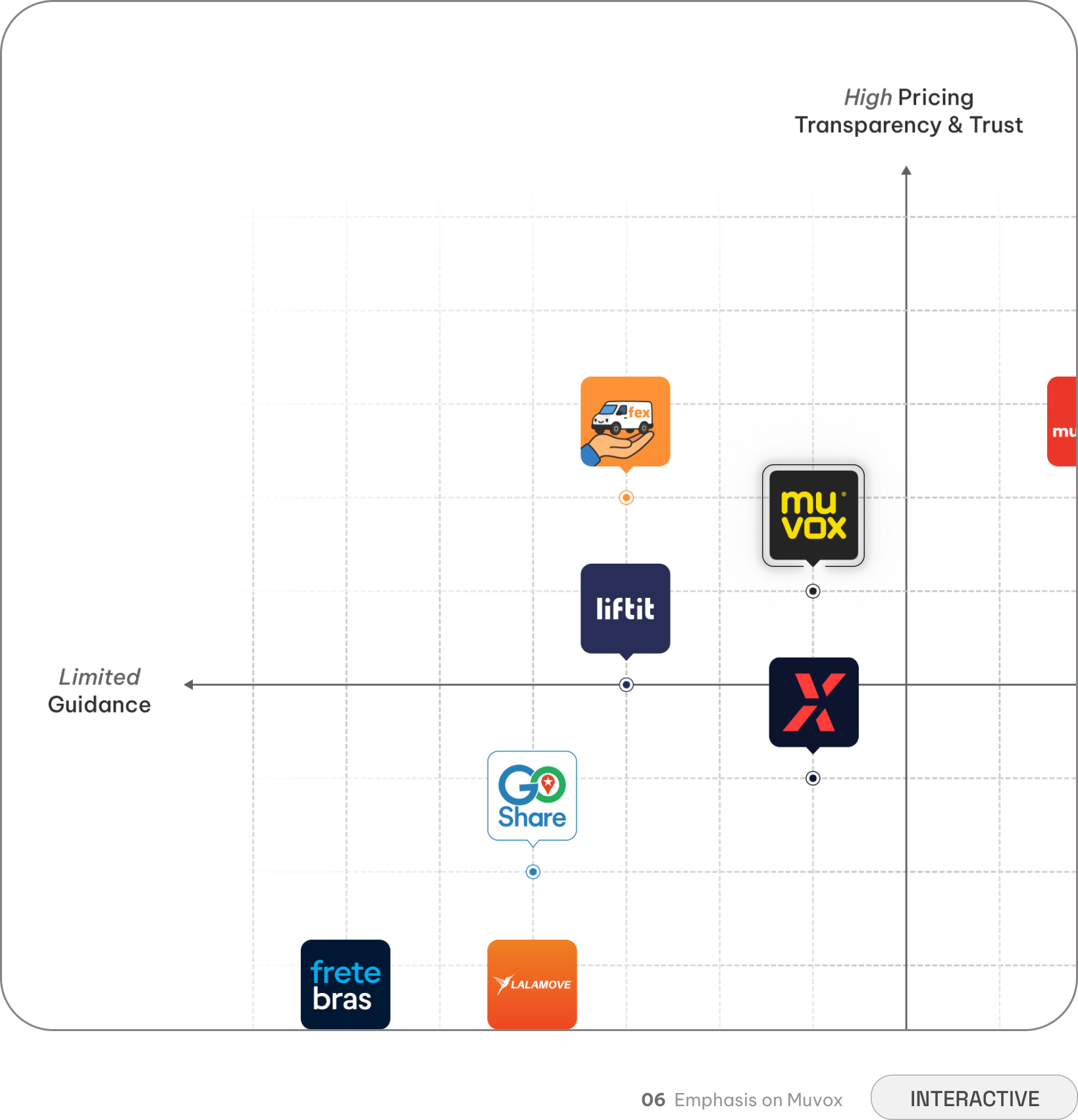
The competitors solved pieces of the problem — but no one solved the whole experience
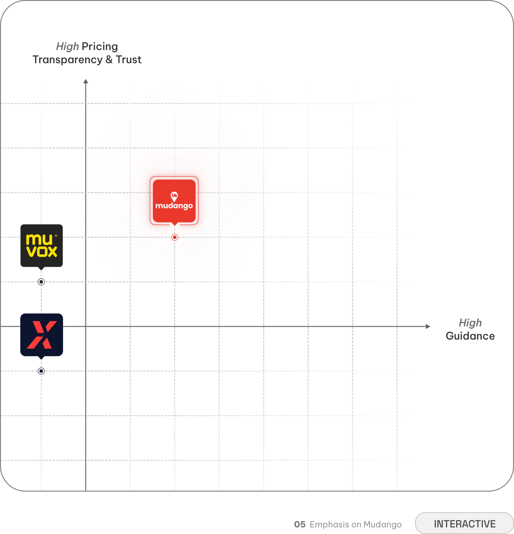
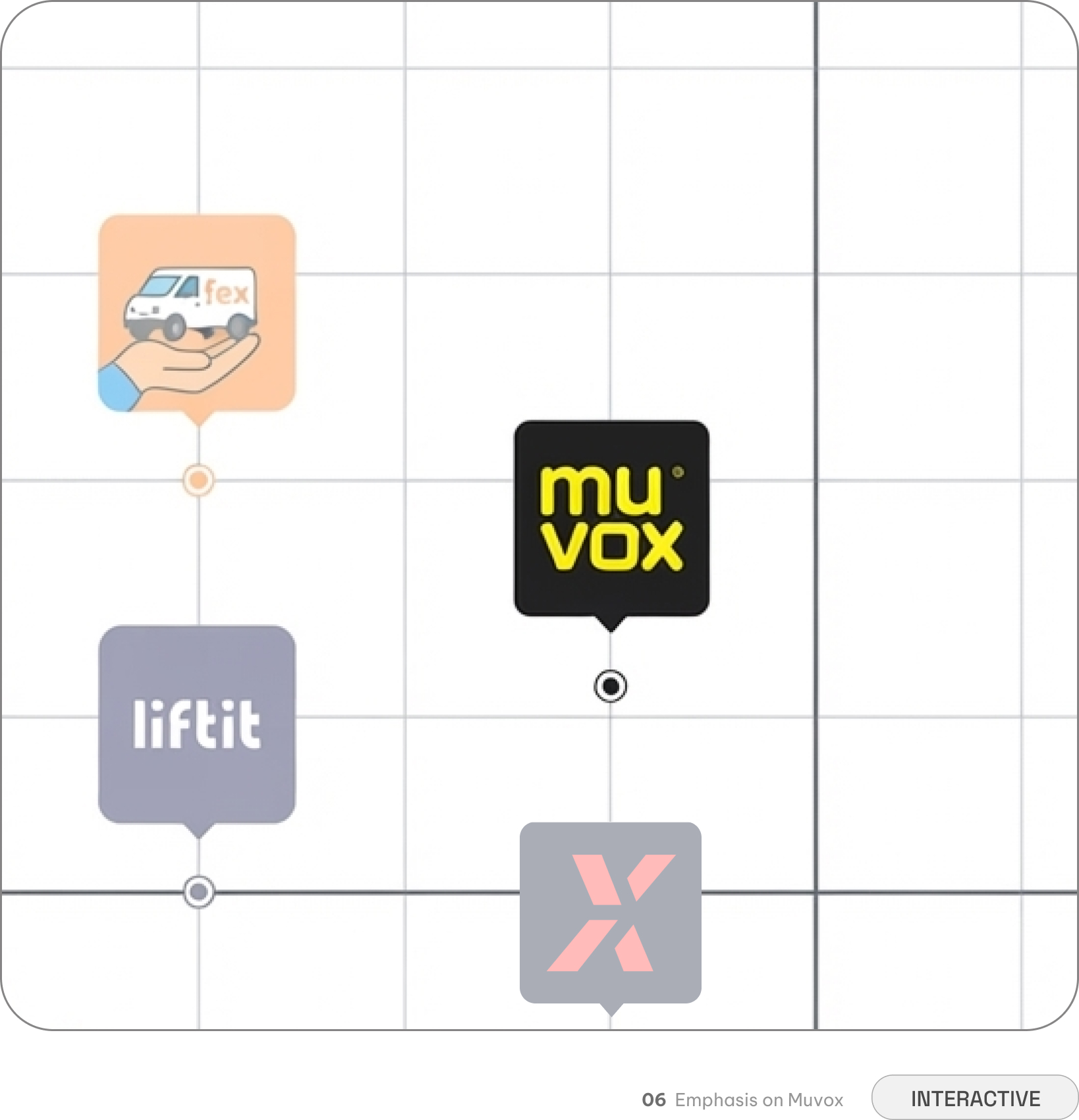
To understand where Genesis could create the most impact, I looked at how existing services handled the burden of moving. The landscape was split into two extremes: traditional rentals like U-Haul left users entirely on their own with zero digital guidance, while app-based movers including Dolly and Lugg solved the physical labor problem but introduced opaque pricing and trust barriers.
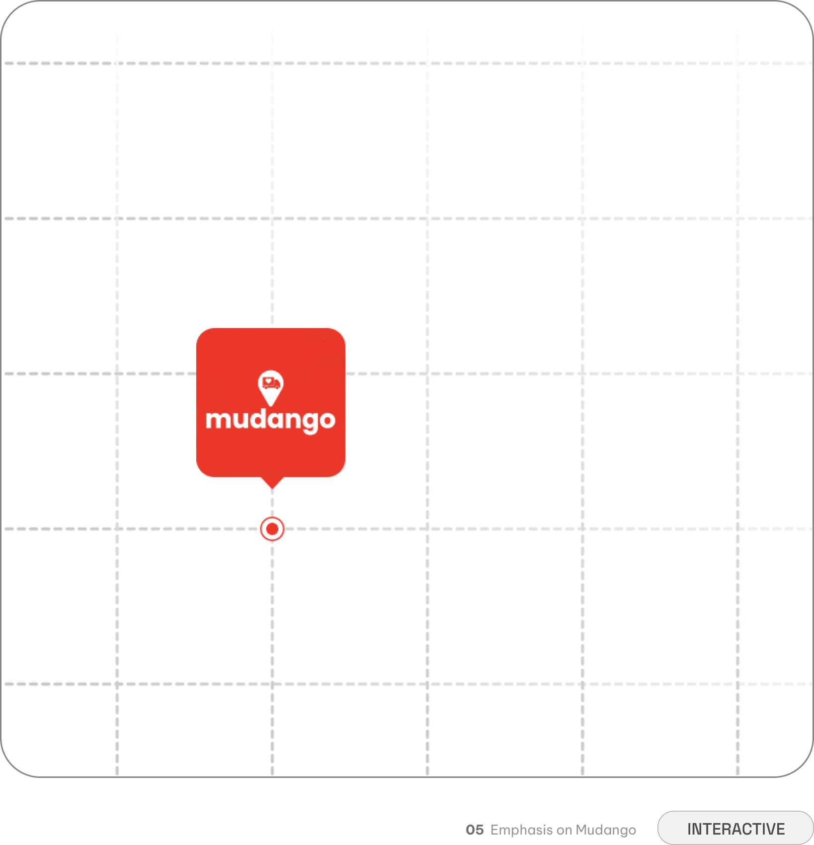
This revealed a massive gap in the market. Genesis didn't just need to connect transportation demand with verified independent drivers — it needed to introduce a highly guided, transparent experience. We needed to build the trust that competitors were missing.
Matched users with moving services directly through the app, eliminating the need to call multiple companies for quotes
Required exhaustive item-by-item cataloging upfront, creating high cognitive friction before showing any cost estimate
Displayed a single total quote without an itemized breakdown for deposits or cancellation terms, creating checkout hesitation
Delivered rapid estimates based on primary route inputs, giving users an immediate financial starting point
Relied on technical vehicle classes rather than guiding users on how their household belongings translated into truck capacity
Clustered all logistical decisions—locations, details, and vehicle types—into a single screen rather than progressively disclosing steps
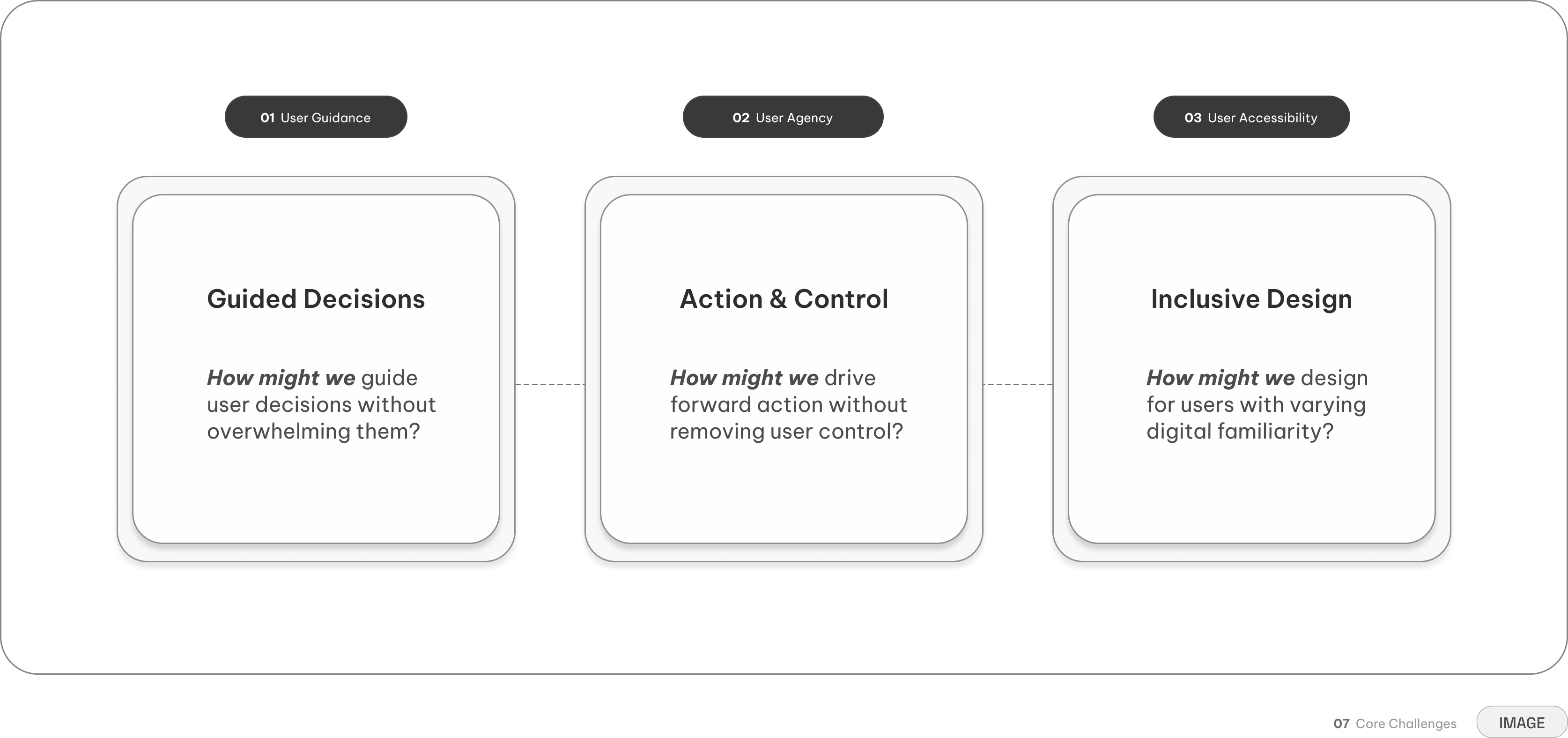
Our three core challenges and guiding questions
The challenge wasn't making the interface look simple. It was deciding what complexity users needed to see—and when. To navigate this, rather than treating each screen as an isolated problem, I used three guiding questions to shape every structural decision.
User Experience
Before designing screens, I had to define the journey
With no existing product architecture to build from, the first challenge was determining how a complex physical process could translate into a digital journey.
I began by mapping the information required to complete a booking and organizing it around the natural sequence of planning a move.
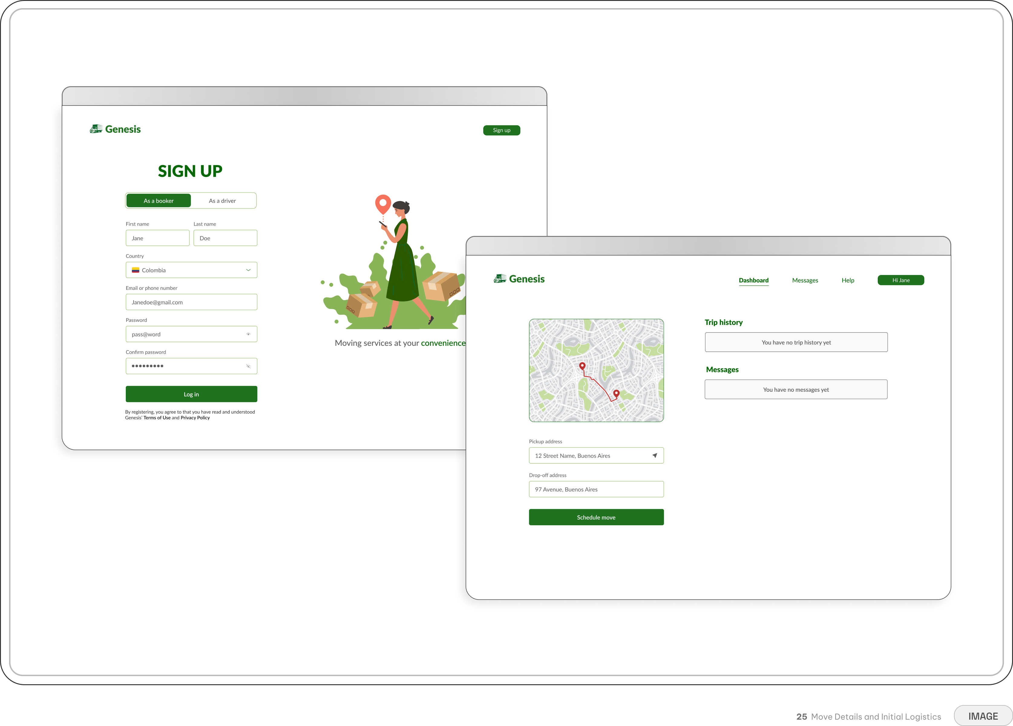
Rather than asking users to provide everything at once, the experience progressed from understanding the move itself to selecting transportation, reviewing the price, completing payment, and receiving confirmation.
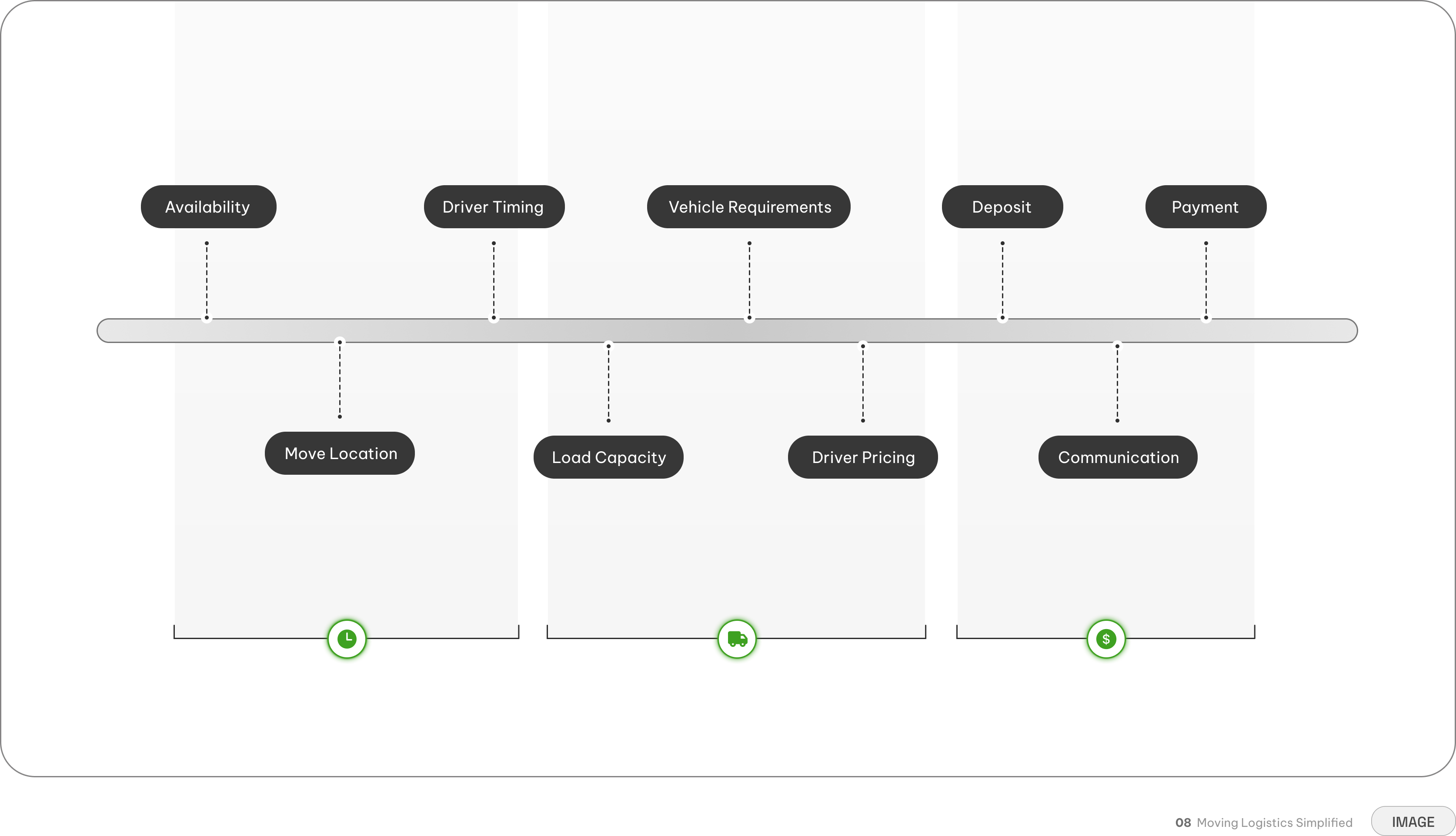
A single move involves various logistical variables, that naturally cluster into three distinct phases
Timing and location — Aligning schedules, arrival windows, and details before touching the logistics
Capacity and specifications — Translating household inventory into the right vehicle size and requirements
Payment and trust — Clarifying deposits, itemized costs, and communication before asking for payment
Mapping the platform flow
This structure became the foundation of the product. Each step answered a focused question before introducing the next, allowing users to understand the process without needing to hold every logistical variable in mind at once.
Once the journey was established, I could begin refining how each decision should work.
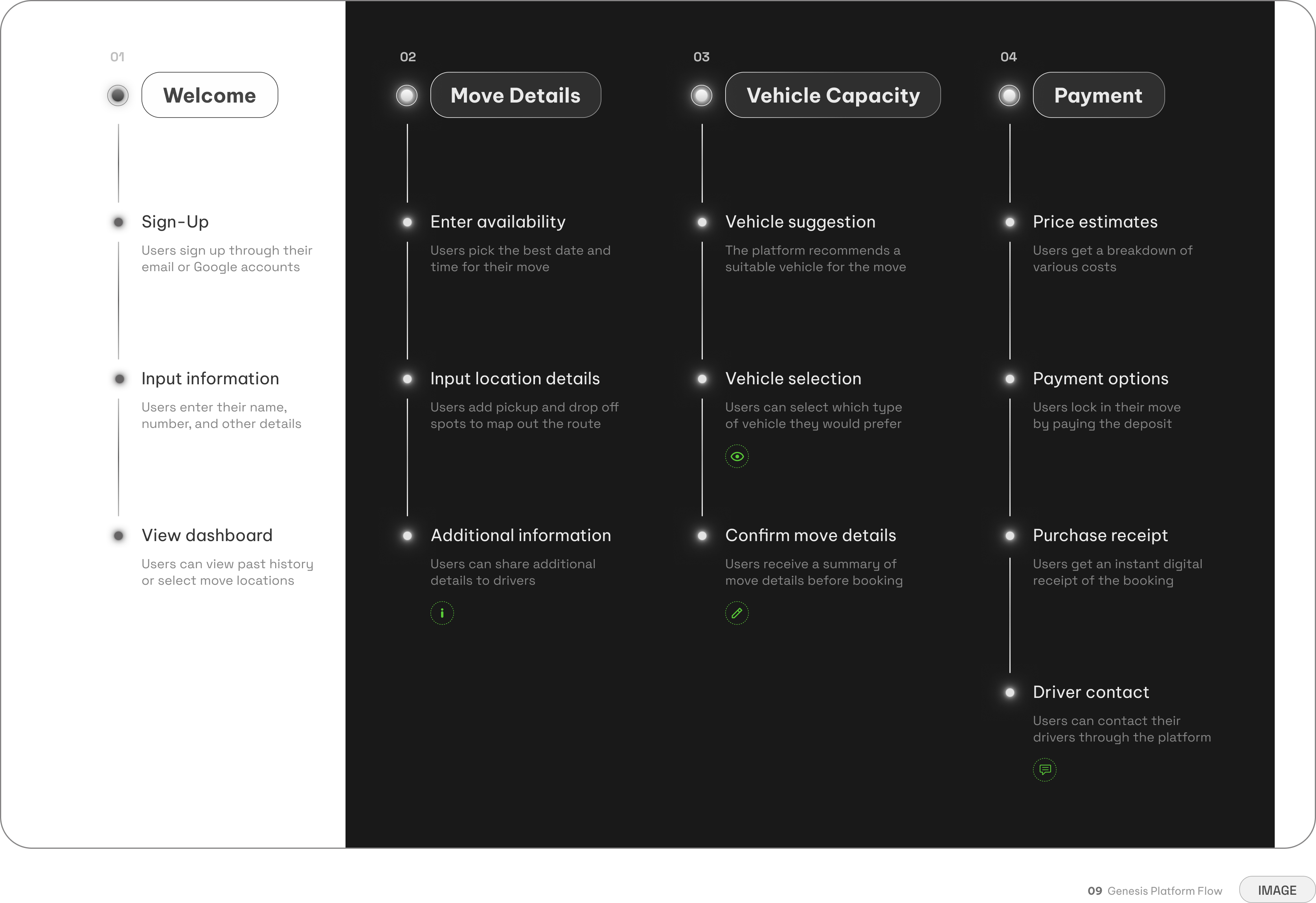
Details are gathered progressively, guiding users through one focused decision at a time before finalizing the move
High-Level Scoping — Exhausting forms and checklists are replaced with quick, easy to answer questions
Transparent Alternatives — The system recommends a vehicle, but gives users full control to browse and select
Simplified Editing — Users can update their details directly from the summary page without backtracking
Integrated Chats — Replaces off-platform haggling with secure, timed in-app messaging for both parties
Key Interactions
Breaking down the burden of choice
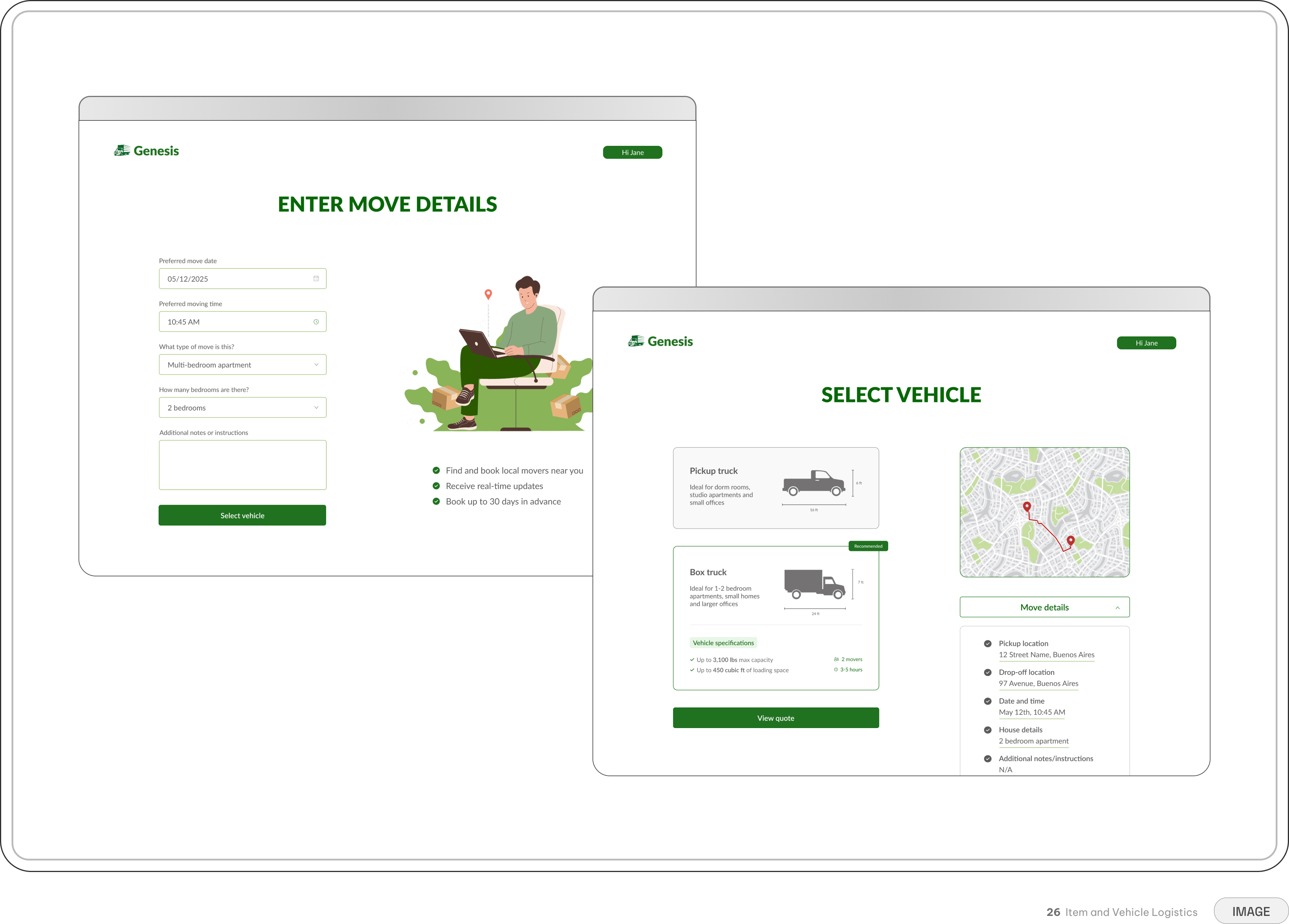
Instead of presenting users with one overwhelming form, I structured the experience around progressive disclosure. Each screen introduced a focused decision, allowing the complexity of a move to unfold gradually.
Rather than asking for all move related details simultaneously, users could focus on one question at a time before moving forward.
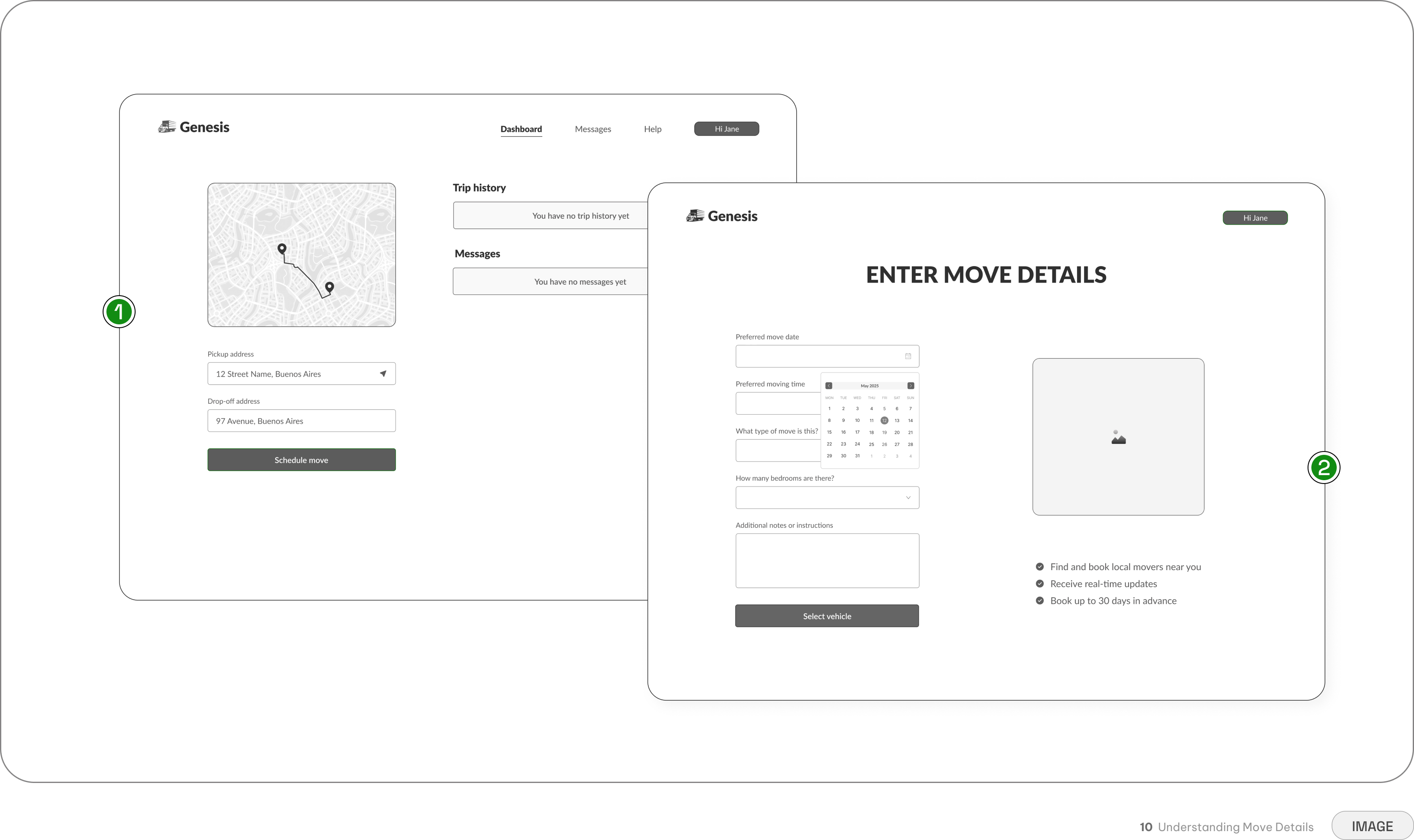
Capturing the route before diving into property details breaks complex logistics into smaller, simplier steps
Locations and distance are locked in before users are asked to detail the specifics of their space
The flow only asks for high-level details rather than overwhelming the user with a full inventory count
Removing the guesswork from logistics
In traditional platforms, users are forced to guess which truck capacity fits their belongings. To eliminate this friction, Genesis automatically recommends the ideal vehicle based on the property details provided in the previous step.
While the system handles the technical translation to reduce cognitive load, users retain full agency to view alternative truck sizes and adjust their selection before requesting a price estimate.
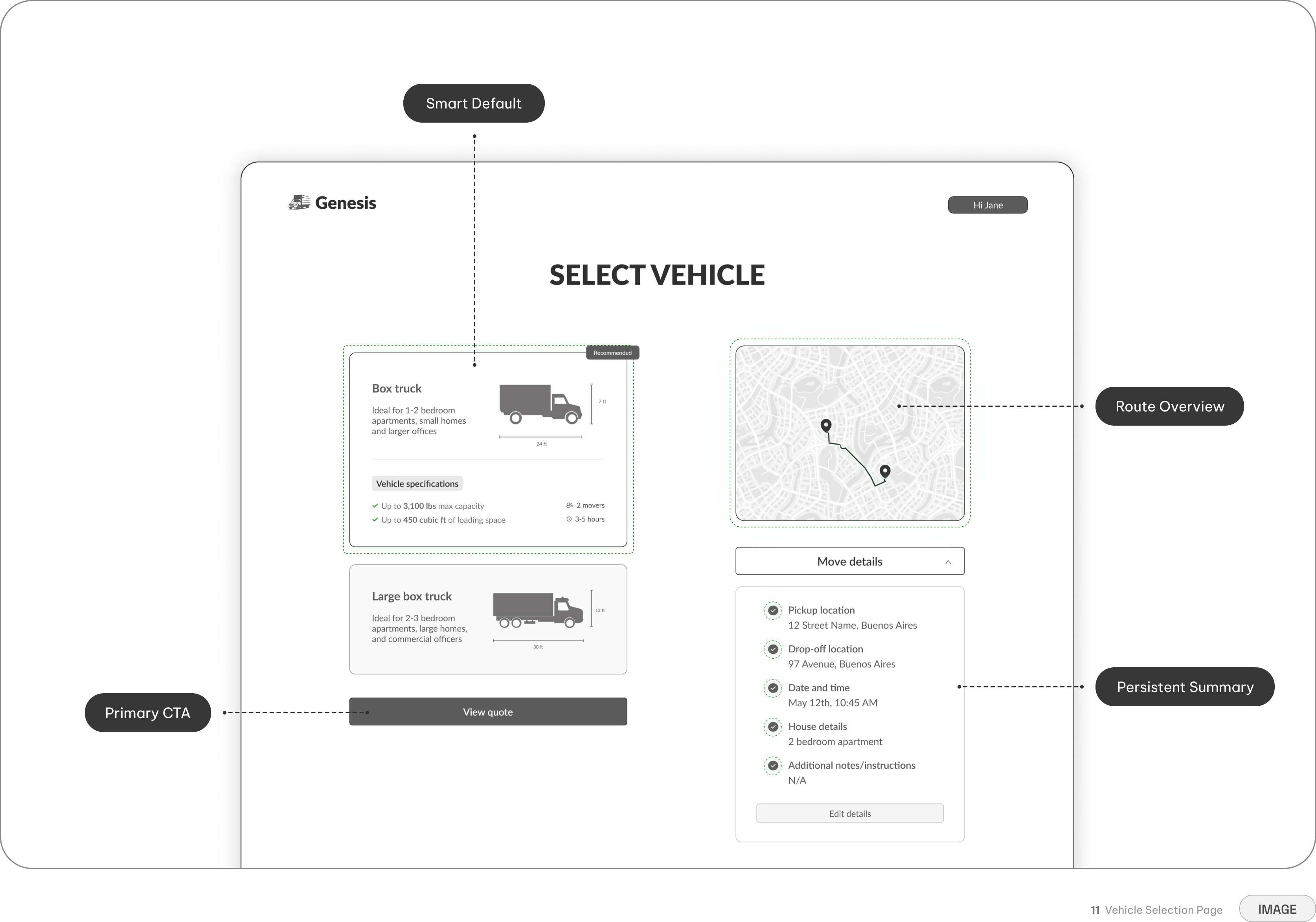
Sometimes fewer options create a better path forward
We initially considered including a "save booking details" option within the booking flow. But because the early journey was designed to collect only the information necessary to reach a price estimate, introducing another exit point before users reached that value moment risked interrupting momentum.
Rather than adding another decision, we focused on making the flow concise enough to complete in one session. However, removing the feature was a tradeoff — it prioritized forward momentum over flexibility.
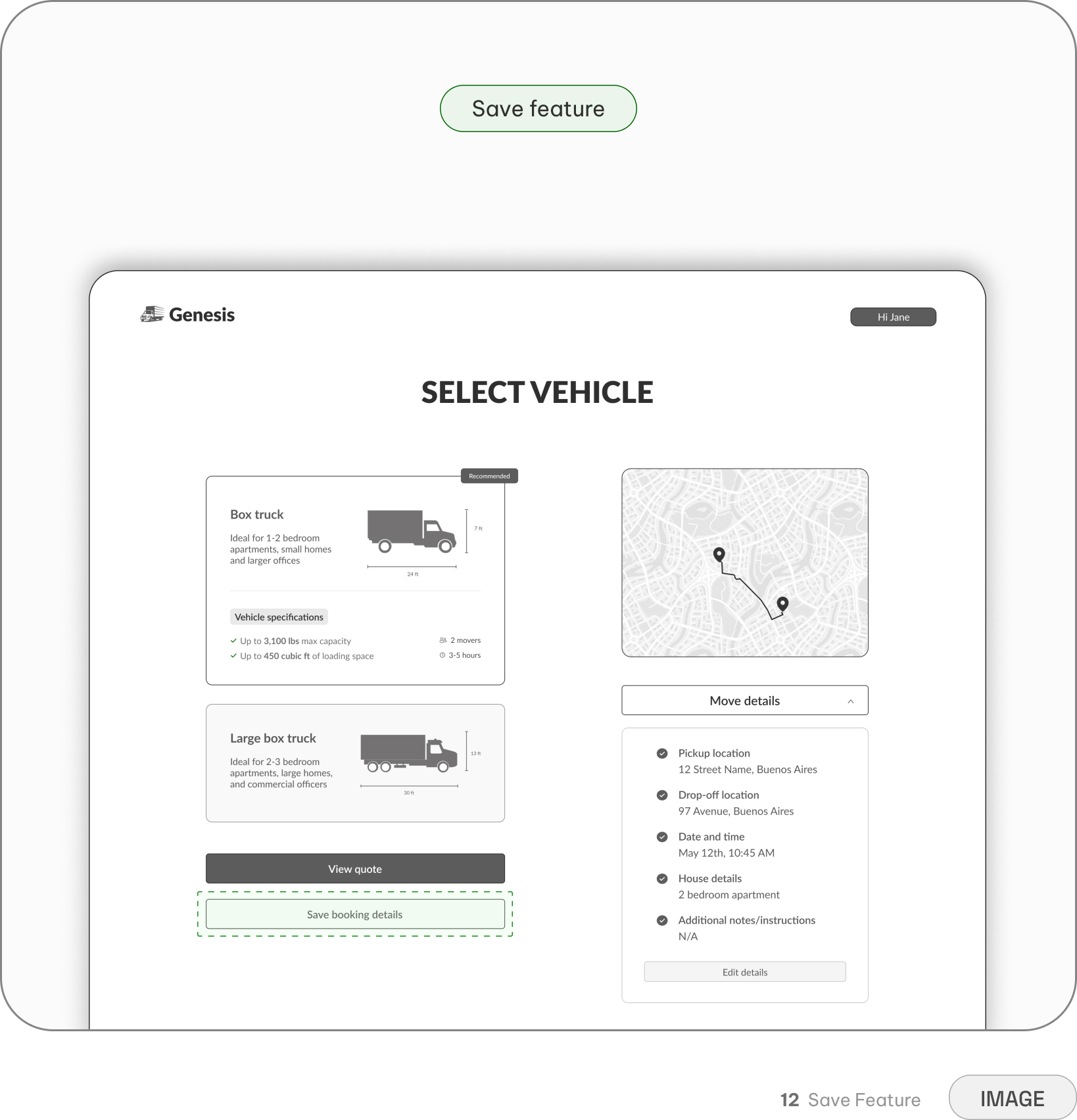
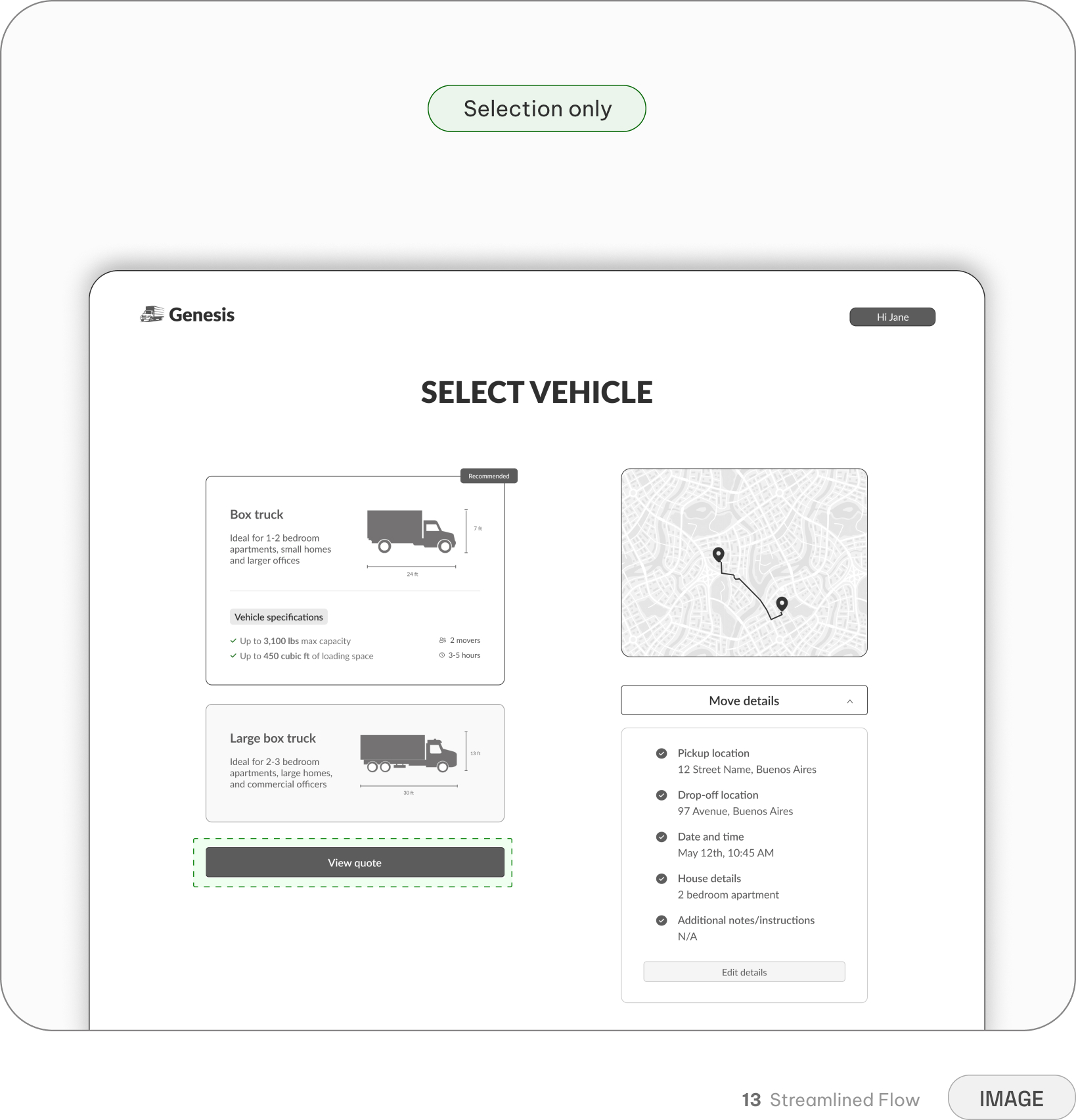
Provides flexibility for users who aren't ready to complete the booking in a single session
Introduces another exit point, disrupting momentum before the user reaches the price estimate
Eliminates secondary decisions, keeping the user entirely focused on moving forward
Drives momentum, ensuring users reach the critical price estimate (the core value moment) faster
Prioritizes forward momentum over flexibility, removing an easy way to pause the experience
Designing trust into the commitment point
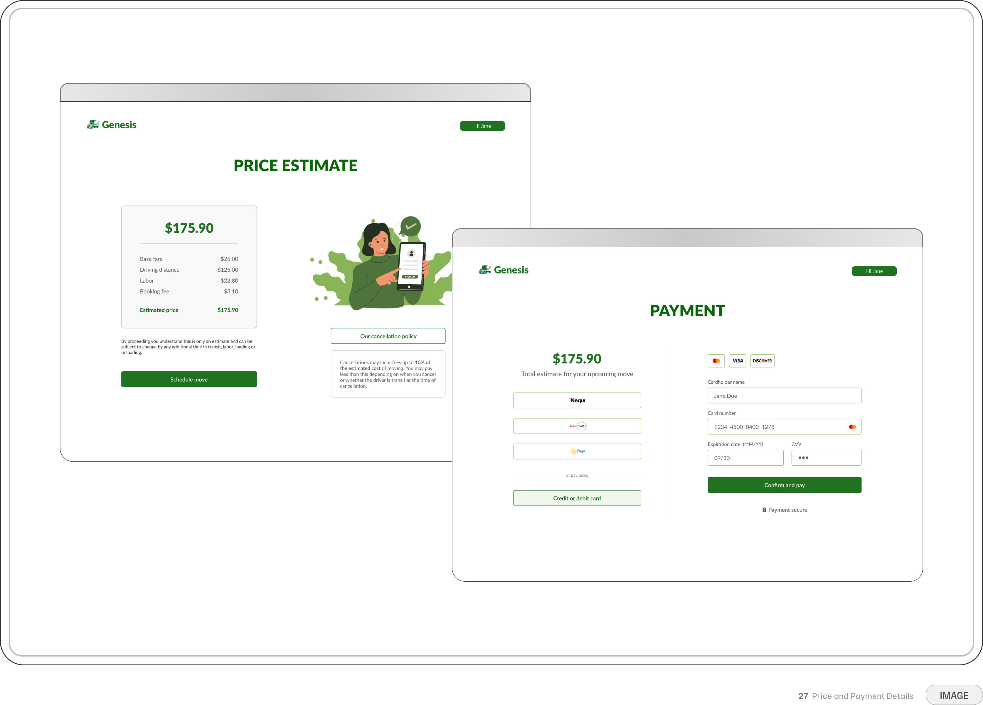
The checkout experience was designed to make the financial process understandable at every stage. Before committing, users could review a detailed price breakdown, understand what was included in their estimate, and see how the deposit contributed to the final transaction.
The flow also surfaced cancellation policies and potential fees, helping users understand the consequences of changing plans before completing payment.
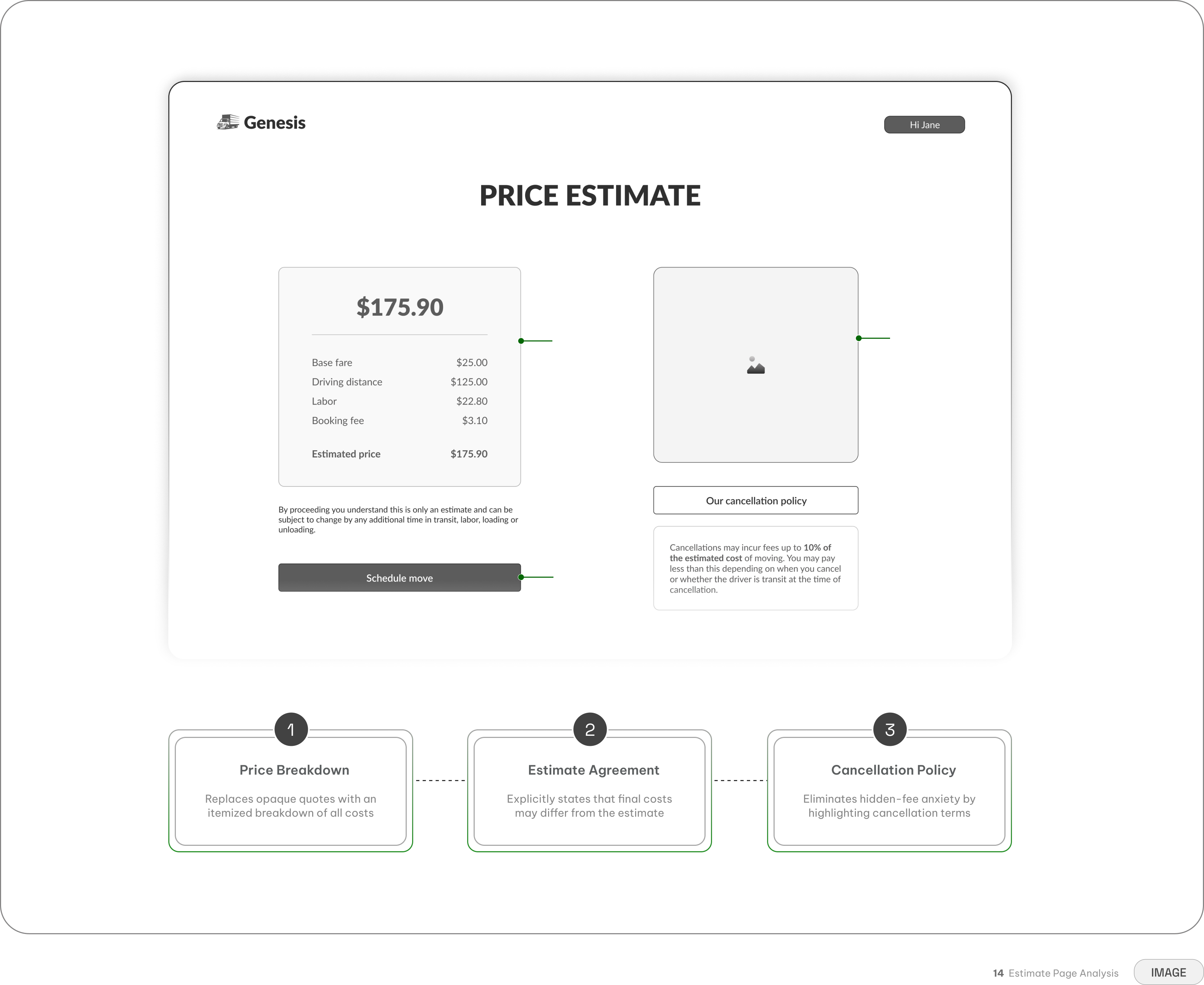
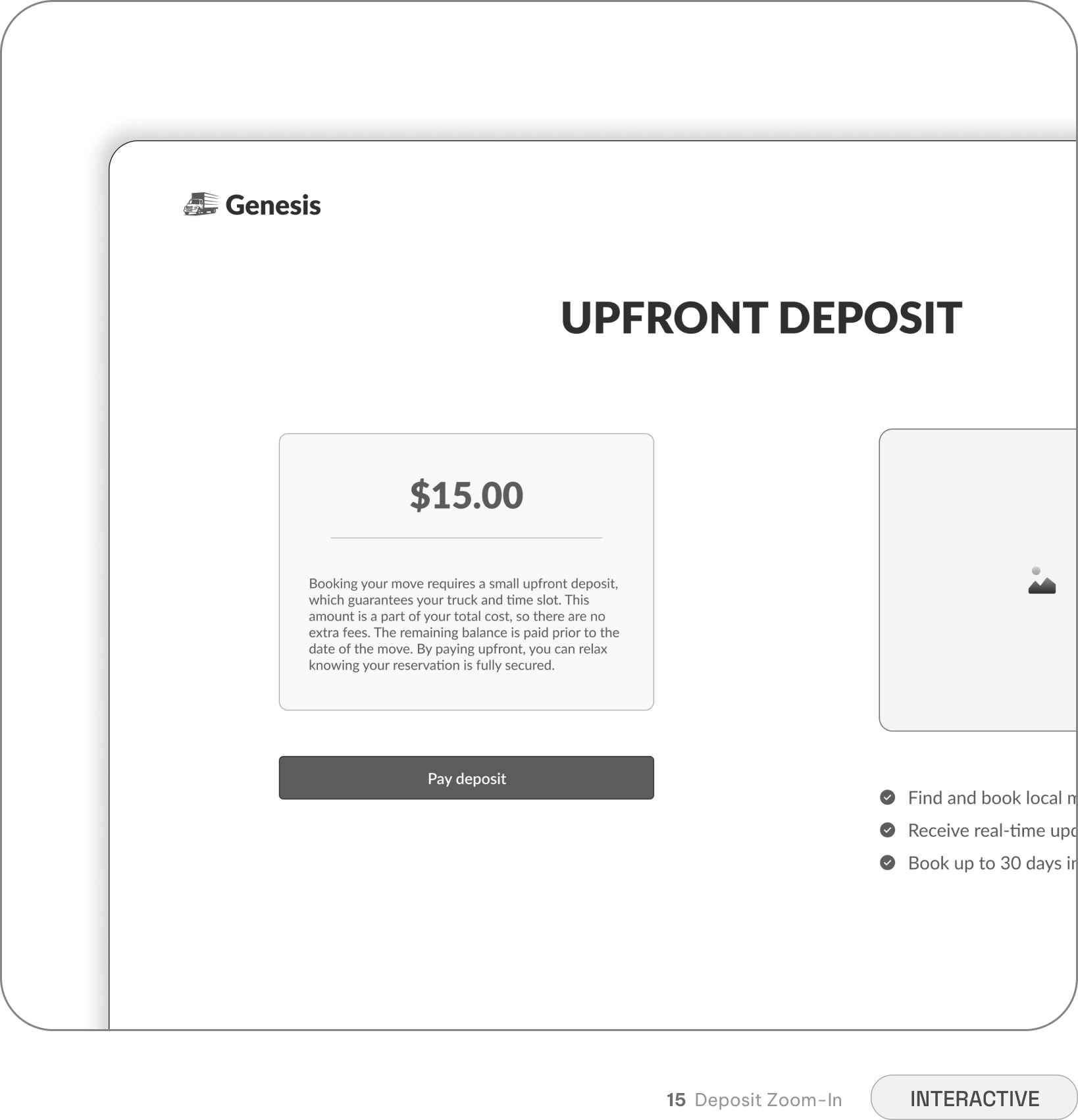
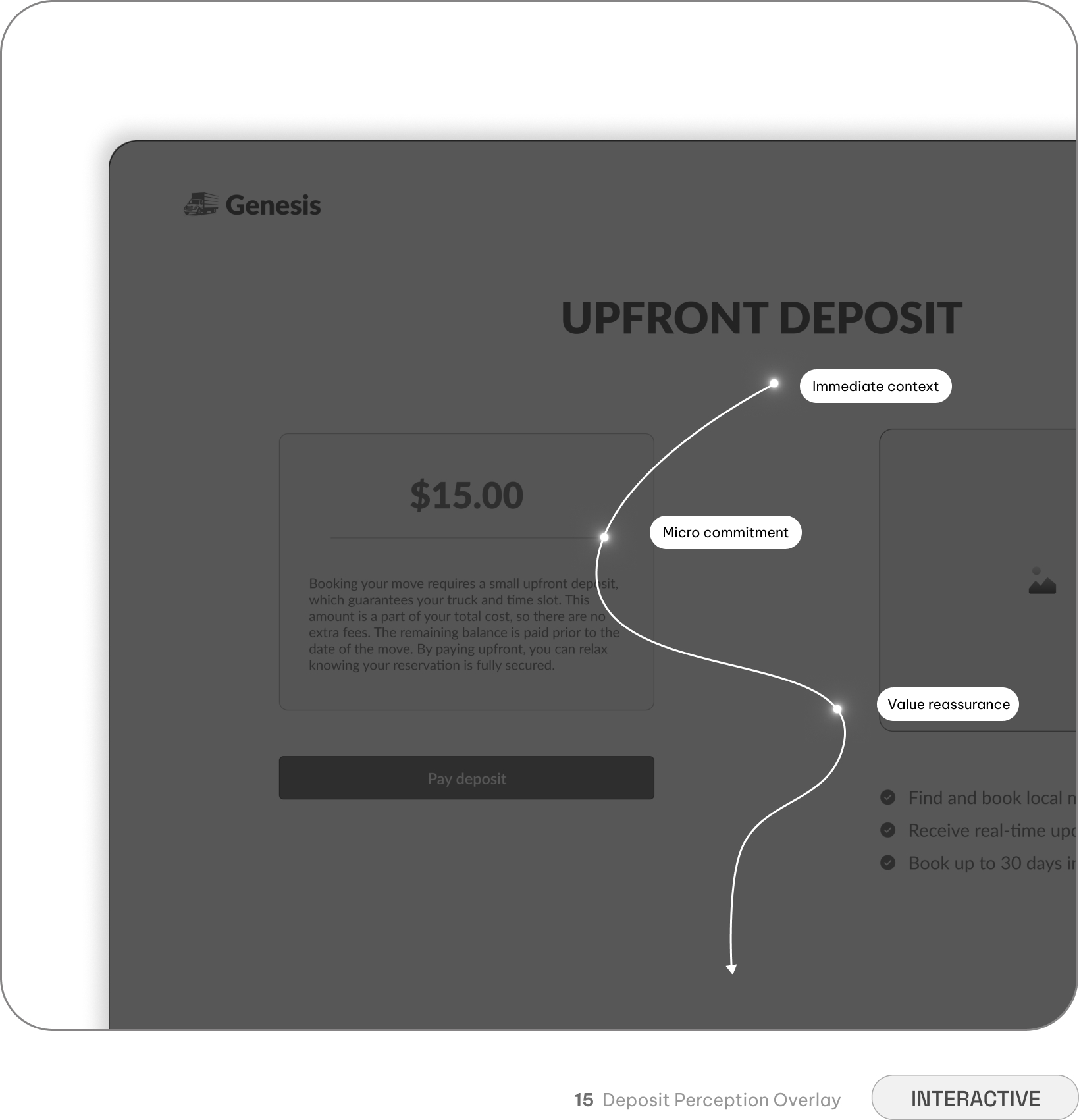
Minimal deposit rather than the full total reduces financial friction and builds immediate trust
Explaining that the deposit locks in driver booking eliminates the anxiety of move day cancellations
Closing the loop and providing certainty
The user journey does not end when they press "pay." Generating a formal digital receipt and outlining clear next steps shifts the user's mindset from digital booking to physical coordination, reinforcing the platform's reliability and ensuring they feel secure in their transaction.
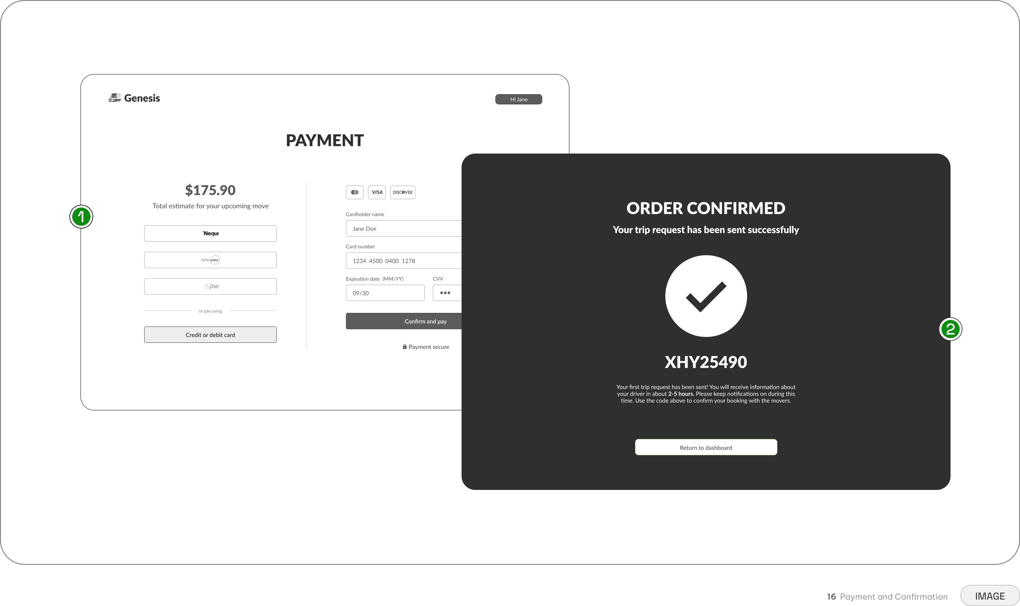
An instant digital receipt provides closure, shifting users from booking anxiety to move-day readiness
Keeping the financial handoff securely inside the platform eliminates the stress of cash negotiations
Generating a verifiable ID and explaining driver assignment removes all post-purchase guesswork
Anchoring the post booking experience
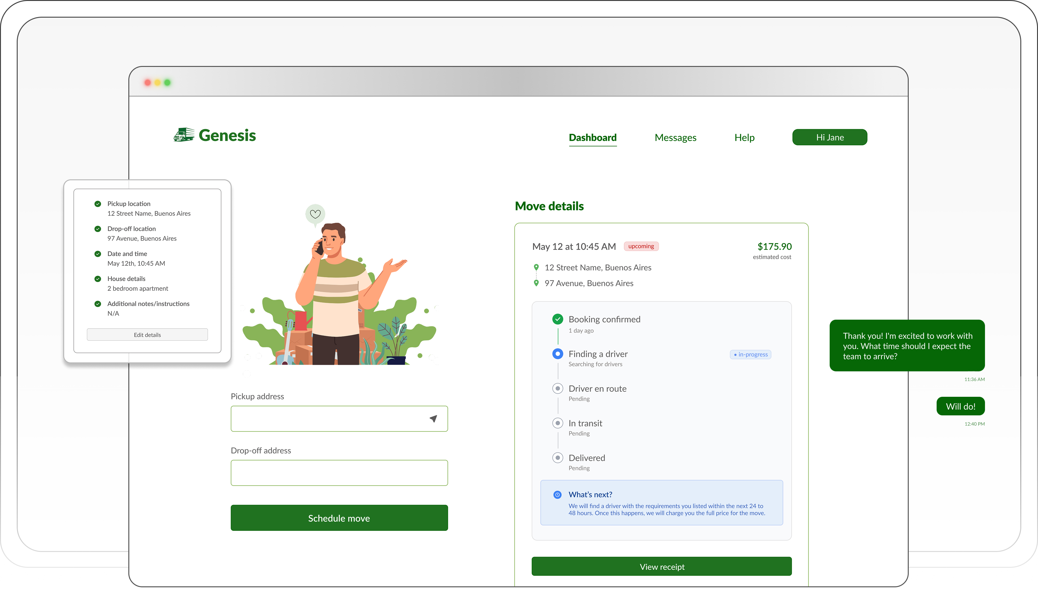
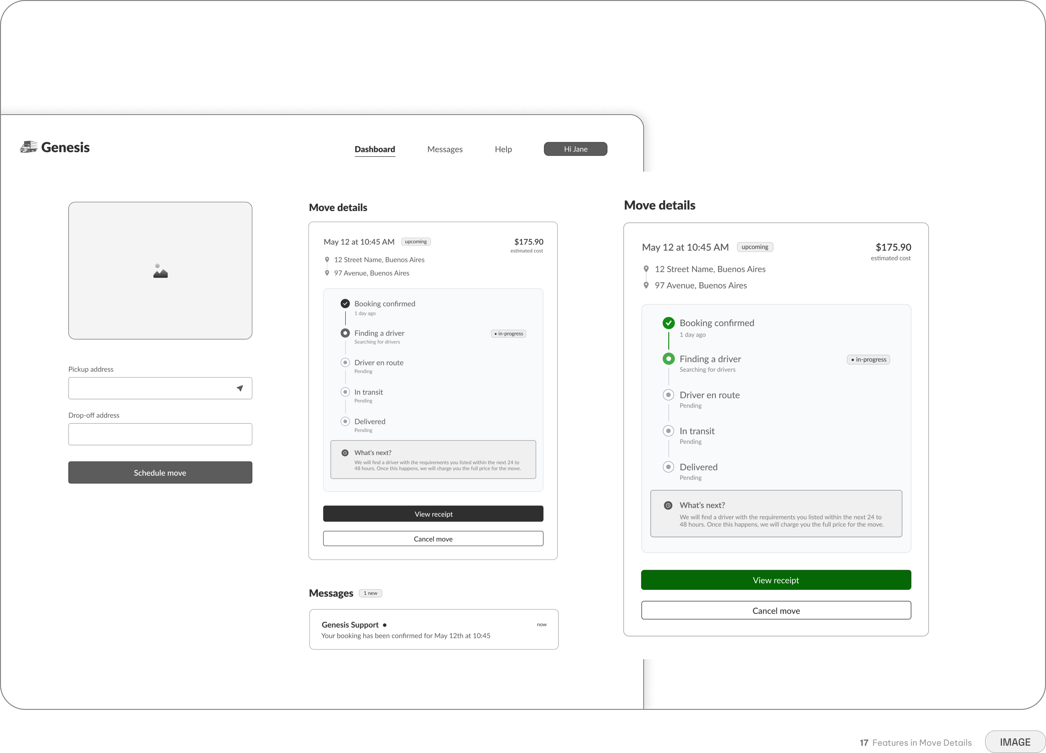
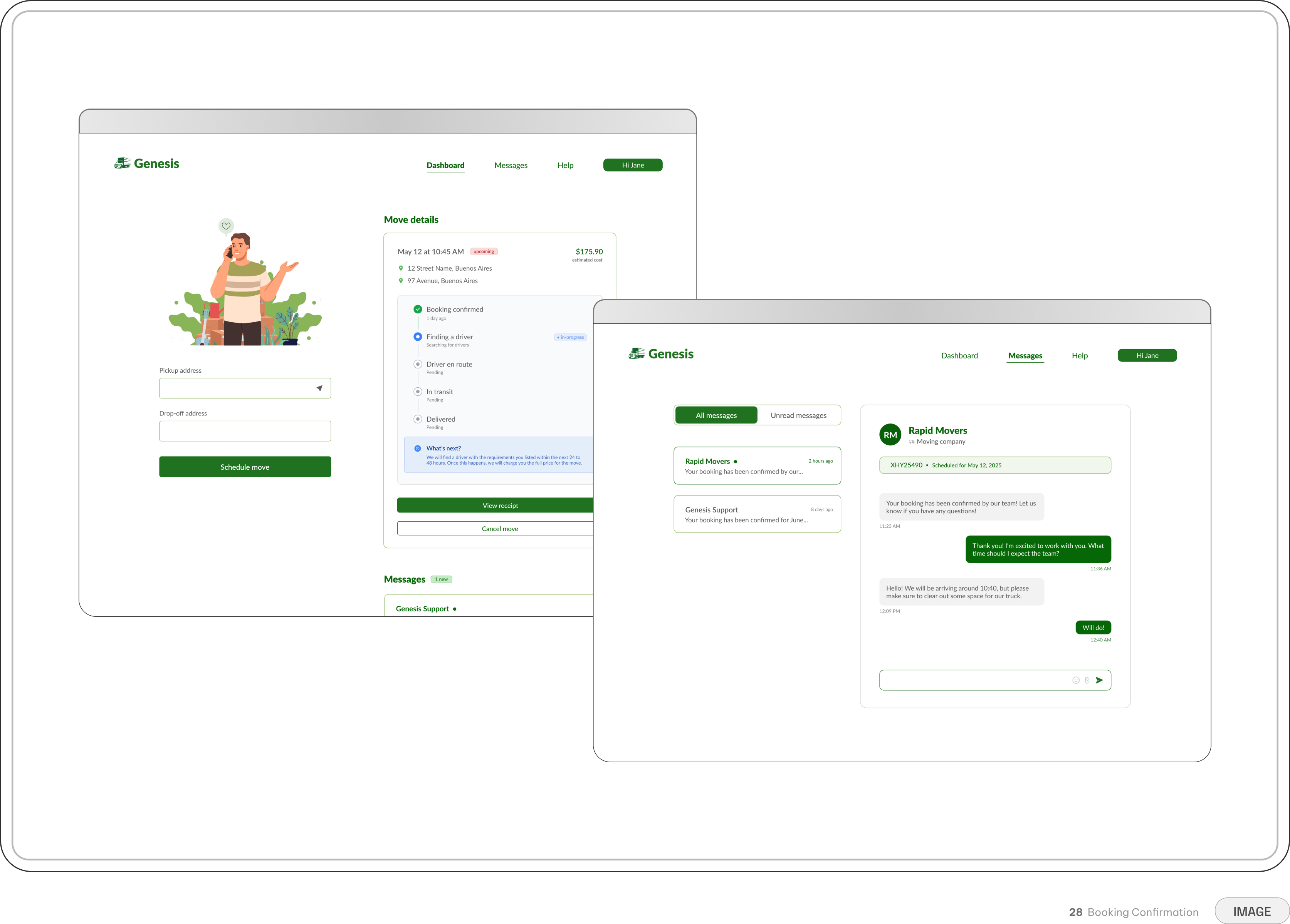
To bring the journey full circle, the post-booking experience serves as a centralized hub for all move details. Rather than leaving users to hunt through scattered email threads, the dashboard provides a clear, step-by-step visual tracker that monitors the move from booking to final delivery.
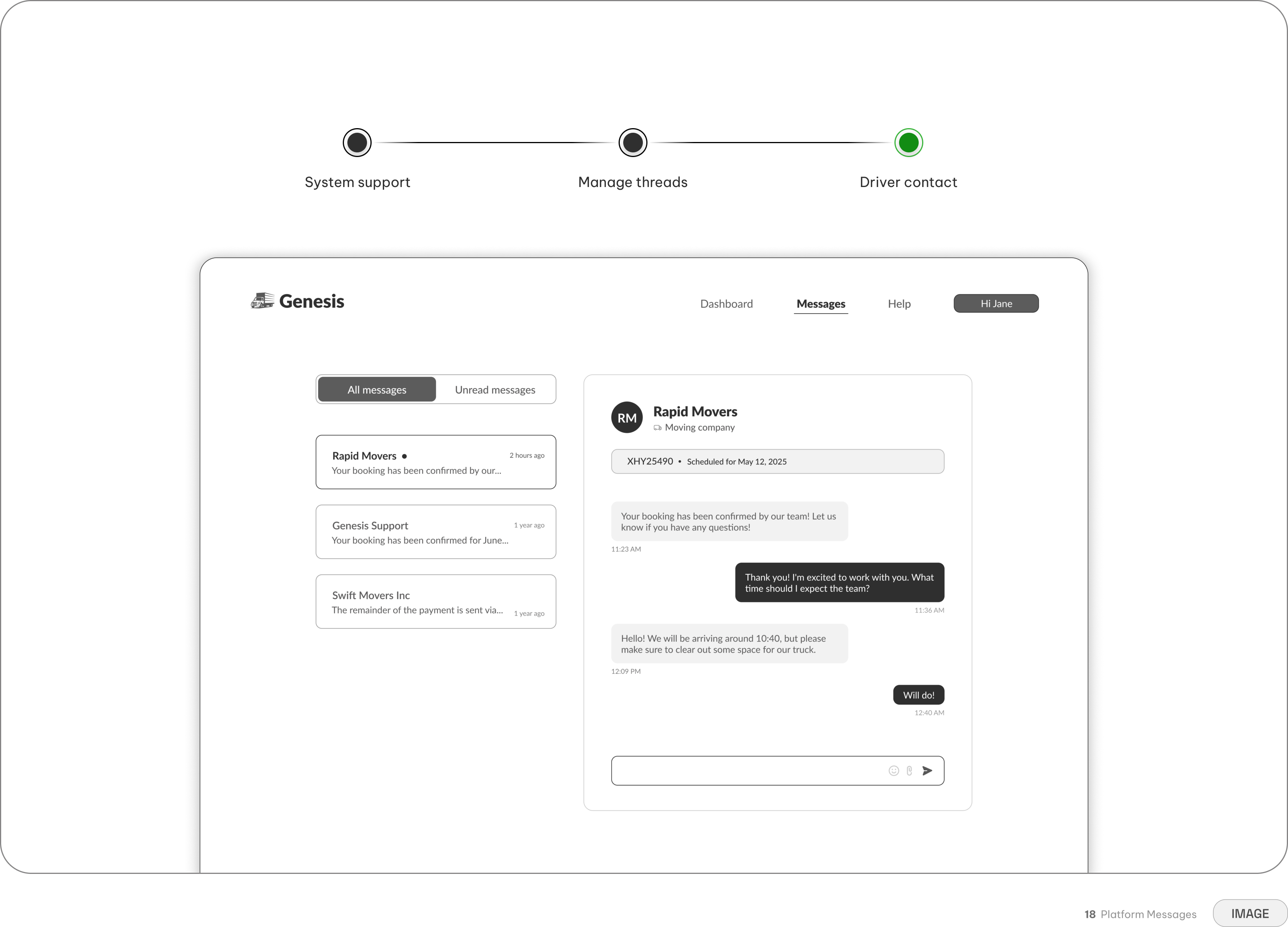
When it's time to coordinate with the driver, users can rely on a secure, in-app messaging system. This keeps all conversations documented within the platform, protecting user privacy and removing the friction of handing out personal phone numbers.
Design System
Grounding the experience through a focused visual language
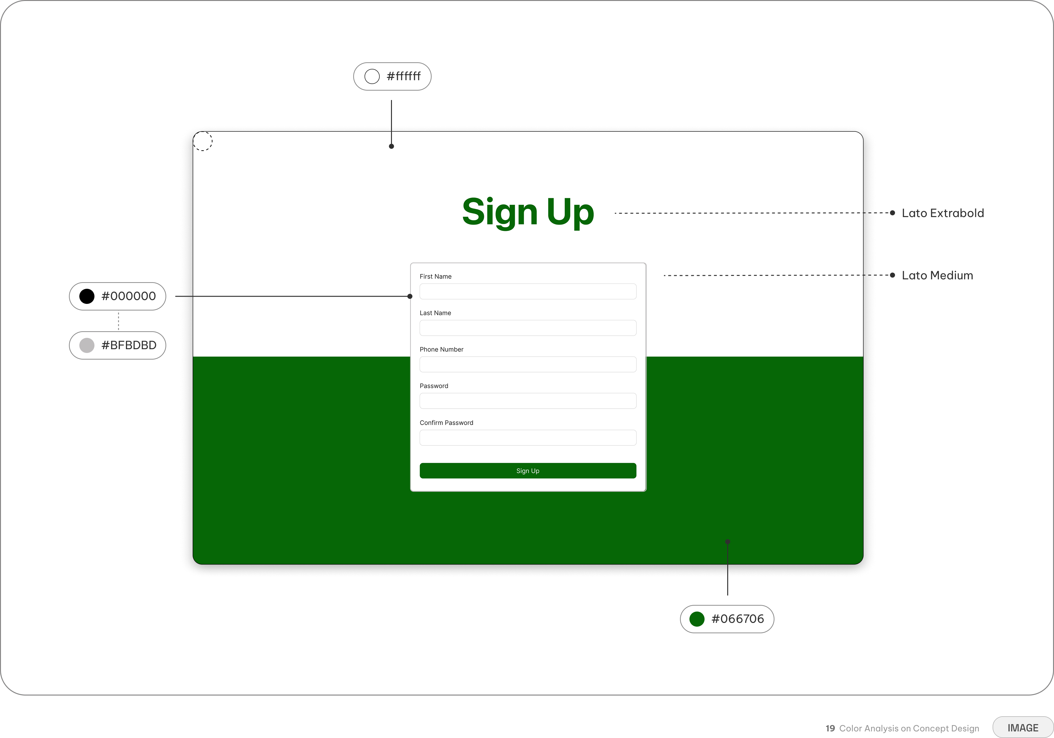
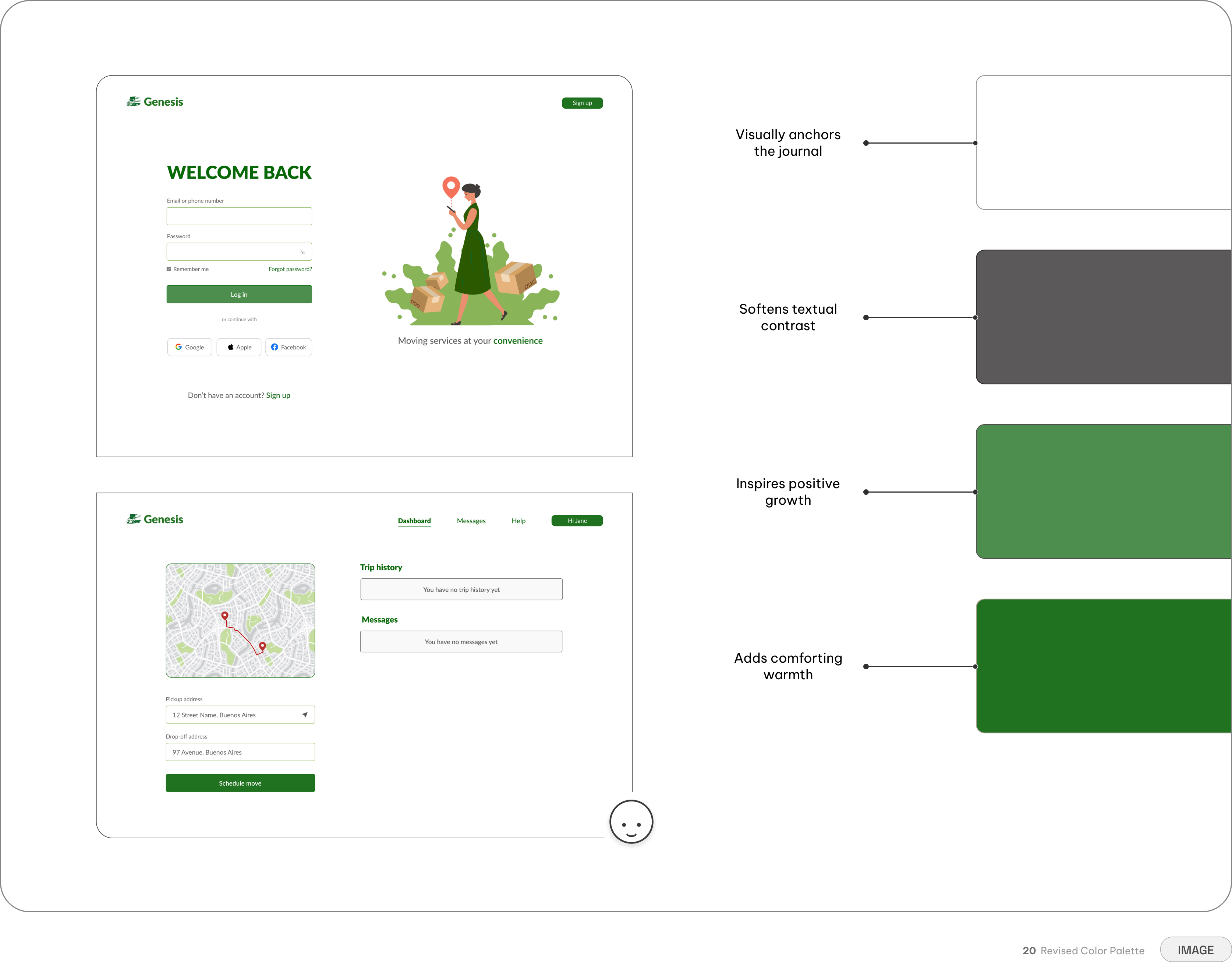
The visual system relies on a focused, high-contrast palette designed to build immediate brand trust and reduce cognitive load. By restricting the palette to a core four-color stack—anchored by the primary Genesis green—the interface maintains a clean, utilitarian aesthetic that never distracts from the core booking tasks.
Typography was selected specifically for legibility across dense logistical information, ensuring that critical details like price breakdowns, dates, and addresses remain highly scannable.
Turning unexpected friction into clear paths forward
Designing for edge cases meant ensuring that user mistakes or system failures were handled gracefully. The platform employs a dual approach to error recovery to prevent drop-off. Inline validation provides real-time, descriptive helper text on forms to guide users before they submit. For high-stakes actions, such as a failed payment, explicit overlapping system alerts instantly notify the user without navigating them away from the page, preserving their inputted data and allowing for quick resolution.
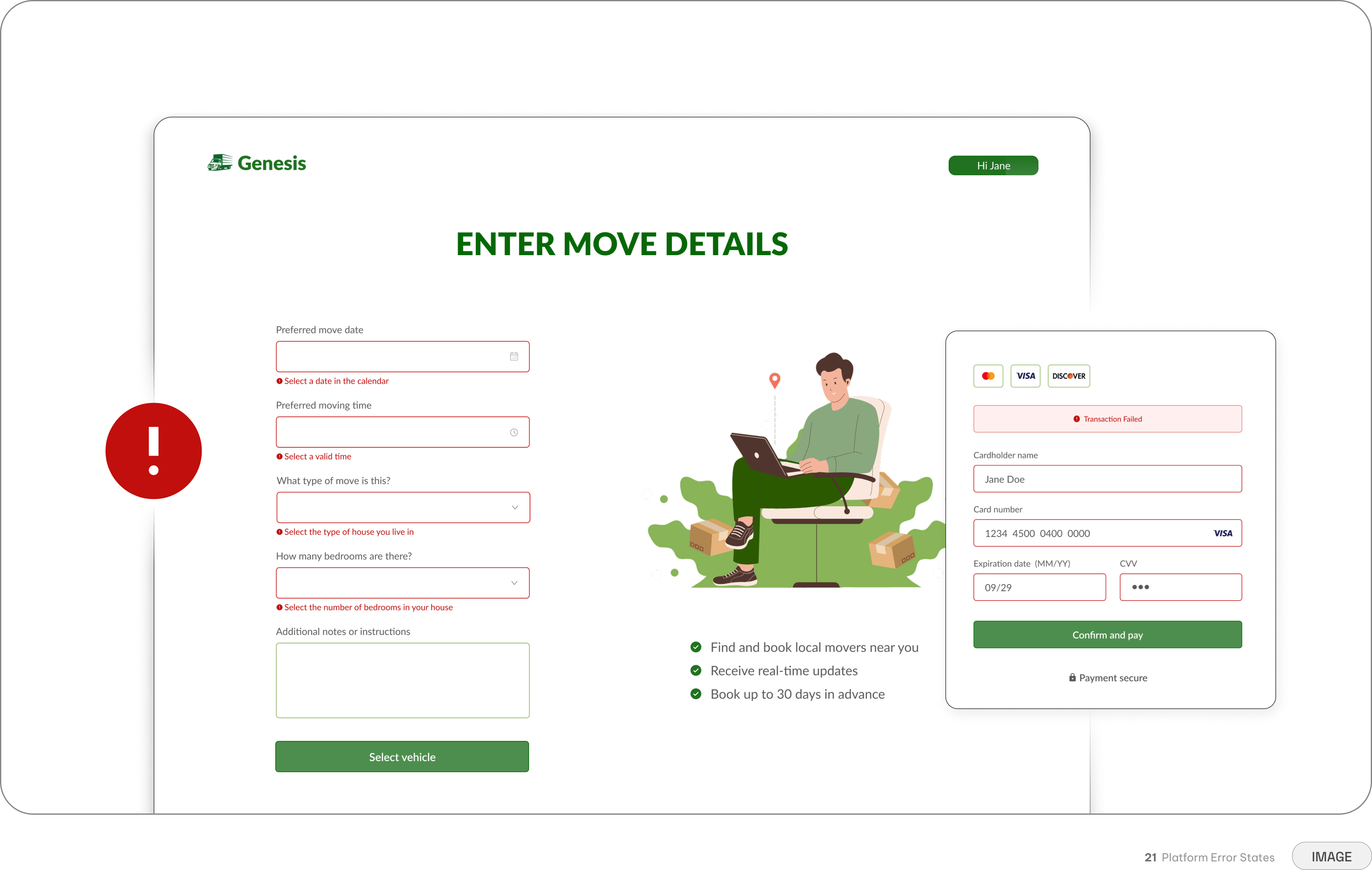
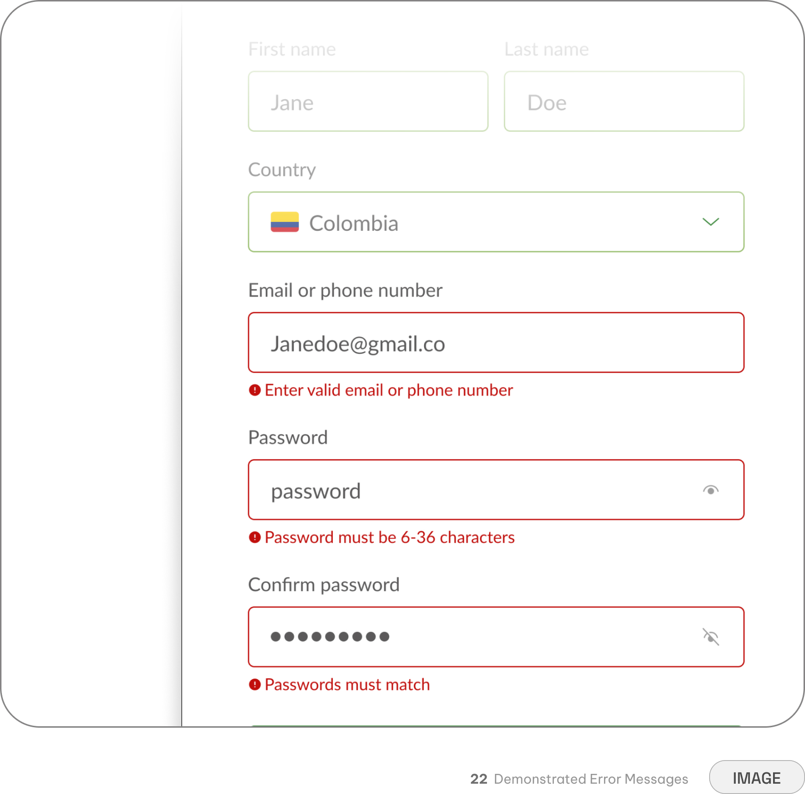
Error Feedback — Clear, specific messaging tells users what went wrong and what to do next
Recovery System — Users can correct a mistake in place, without losing progress elsewhere in the flow
Proactive Prevention — Constraints and inline validation catch likely mistakes before they happen
Consistency made the complexity disappear
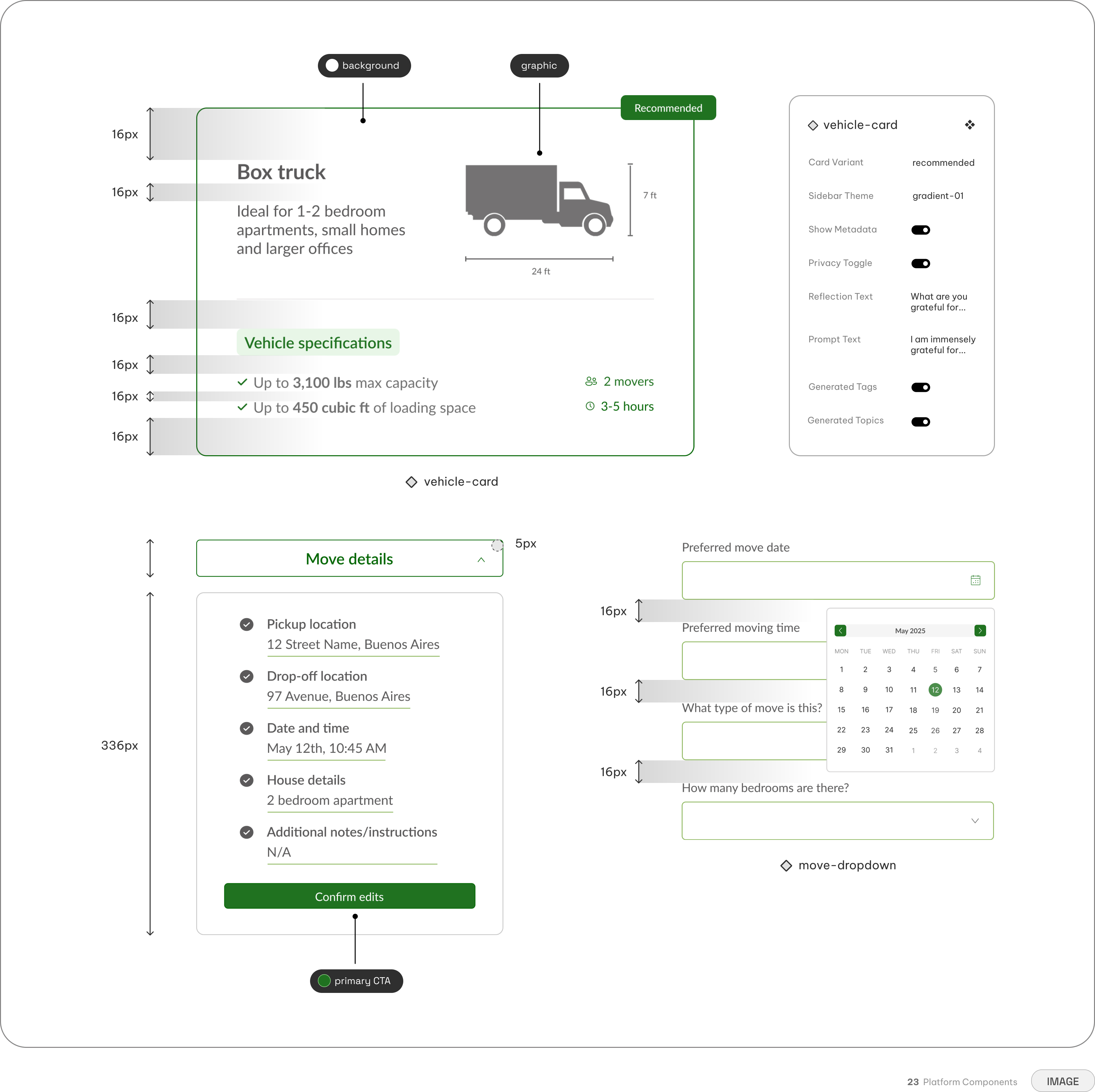
To maintain consistency across the booking flow, the interface was built using a robust, reusable component library. Interactive elements, such as the progressive vehicle selection cards and modular text inputs, were standardized to ensure predictable behavior. All primary call-to-action buttons and form fields maintain a minimum 44x44px touch target, embedding usability and accessibility directly into the component structure rather than treating them as an afterthought.
Scaling the experience across devices
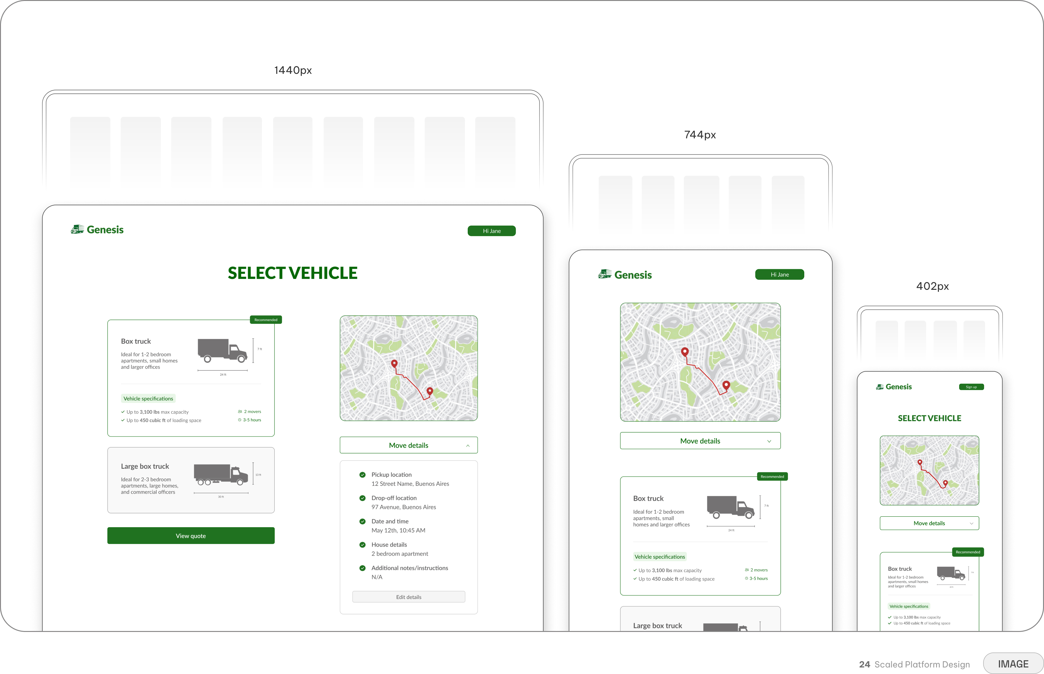
The structured, single-decision screens were designed specifically to scale seamlessly across breakpoints. By keeping the layouts vertically stacked and prioritizing progressive disclosure, the interface adapts naturally to smaller mobile devices without sacrificing visual hierarchy. This ensures that the core booking experience—from the initial route visualization to the final digital receipt—remains just as intuitive and uncluttered on a phone as it is on a desktop monitor.
The system in practice
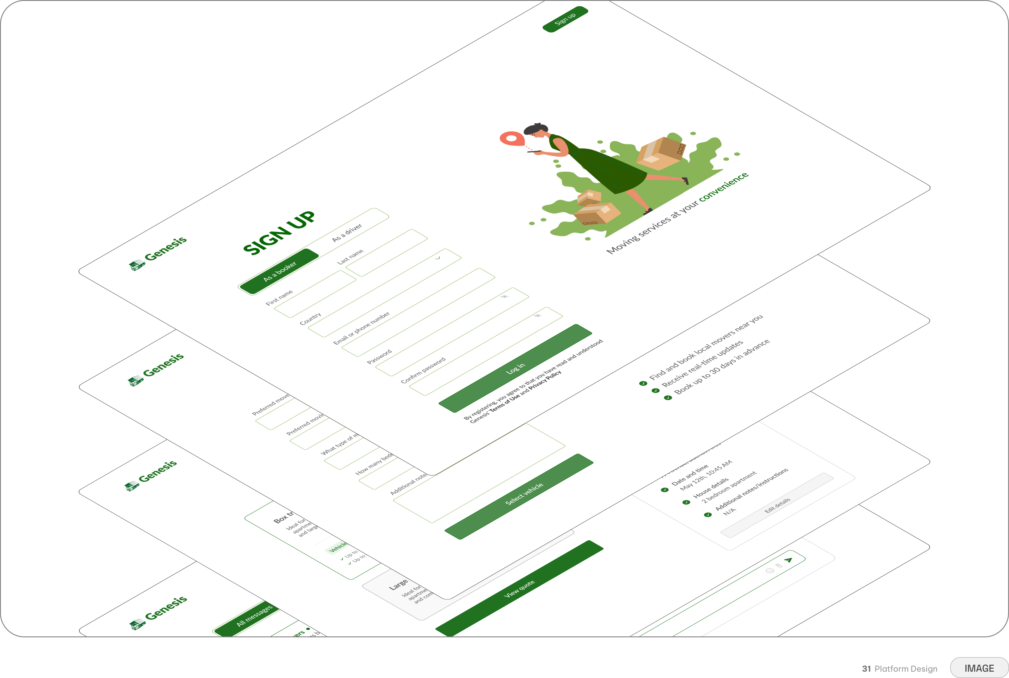
The final system had to work across every part of the experience—from route planning and vehicle selection to secure payments and post-booking coordination—without making the interface feel overwhelming. Each interaction provides enough structure to guide users without competing with what matters most: the clarity of their move.
The result was a visual system that made a complex set of logistical steps feel like one cohesive experience. The focused palette, reusable components, and clear hierarchy work together to give Genesis a consistent identity from the first booking screen to the final delivery dashboard.
Early Validation
Did the experience actually feel manageable?
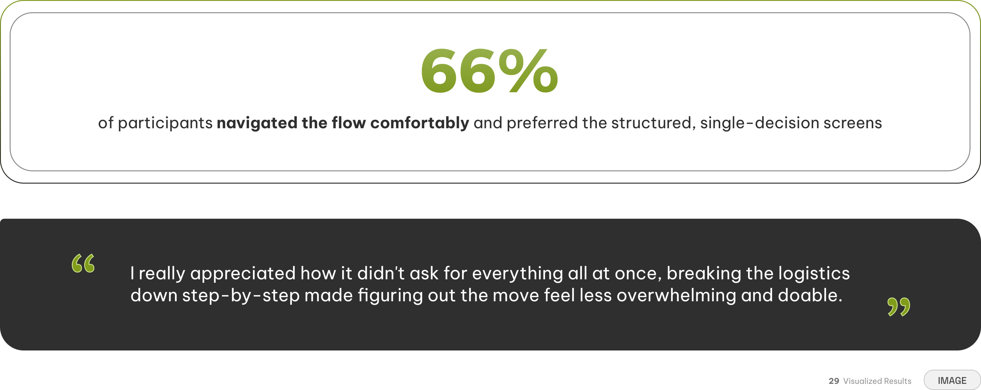
After refining the booking journey into a high-fidelity, interactive prototype, we tested the experience with six participants from Latin America. Four of the six participants compared the multi-step experience favorably to familiar transportation products like Uber and Lyft. Breaking the booking into focused decisions helped participants understand what was being asked of them without confronting every logistical variable at once.
The feedback supported the structural strategy behind the experience: complexity didn't necessarily need to disappear—it needed to be introduced at the right moment.
The tension between disclosure and transparency
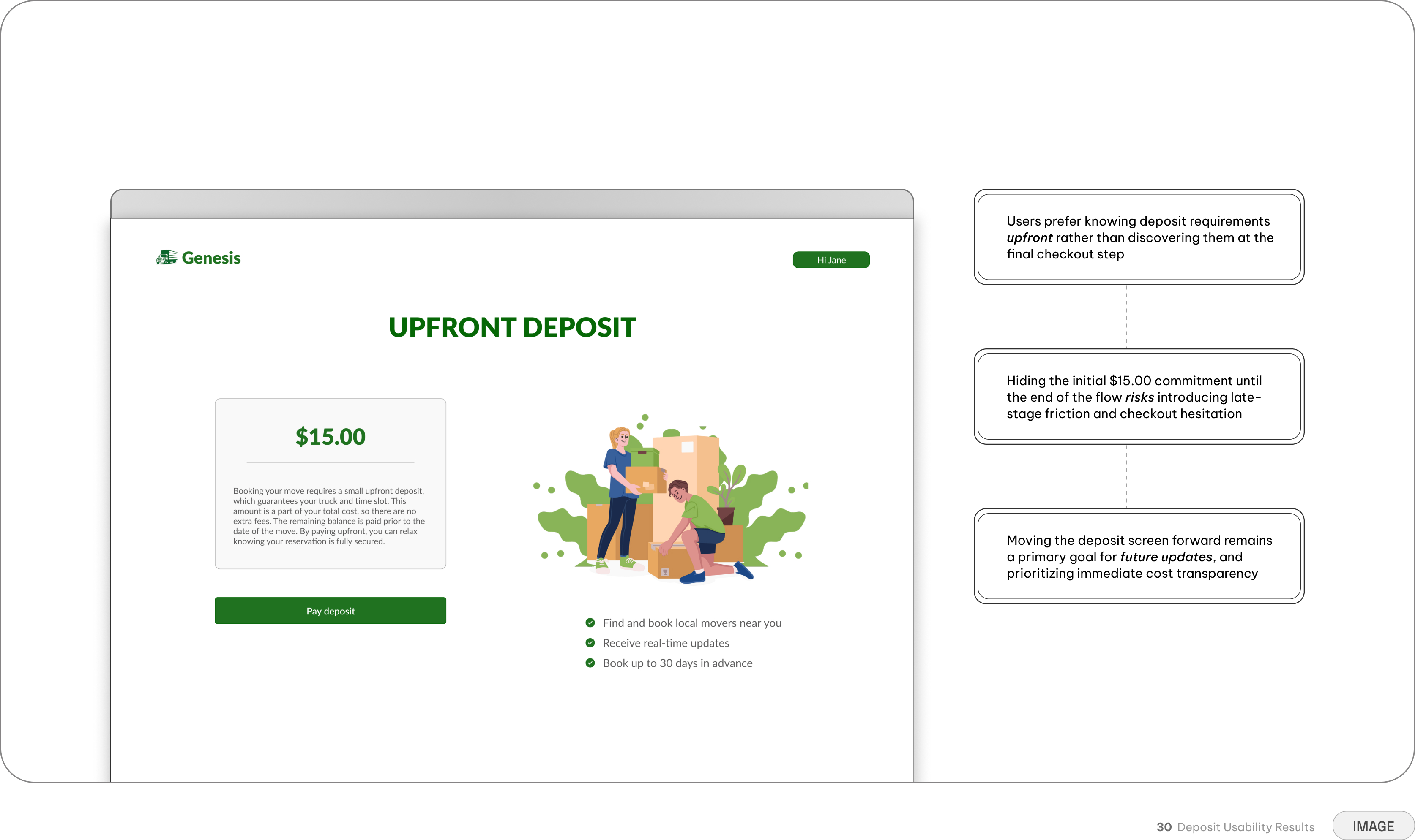
Usability testing revealed an important tension within the design: prioritizing progressive disclosure meant sacrificing early financial transparency. While users appreciated the step-by-step logistics, they felt blindsided by discovering the deposit requirement at the very end of the flow. This feedback highlighted a clear need to introduce the upfront cost well before the final checkout screen.
Retrospective
Building a foundation before seeing the outcome
Because my involvement concluded prior to public launch, success was measured through the delivery of a robust MVP foundation rather than live marketplace metrics. The primary outcome of this phase was a complete end-to-end customer booking architecture, supported by an interactive prototype and a scalable component system.
Ultimately, this work answered the core question of what Genesis could become. Rather than just a collection of visual concepts, it established a cohesive, user-centered experience with the structural maturity required to move directly into development.
My key takeaways
Designing Genesis changed how I think about the relationship between digital interfaces and physical logistics. A dashboard isn't just a layout of information, it also provides the exact peace of mind someone needs on moving day. The biggest lesson I took from building this MVP is simple: good product design doesn't just organize complex tasks. It replaces real-world anxiety with predictable certainty.
Transparency is a part of trust
Hiding complex logistics or costs doesn't help the user — translating them into clear, actionable steps at the right time does
Pacing can prevent frustration
Moving is inherently complex, but through progressive disclosure, logistics become single-decision screens that maintain user momentum without triggering cognitive overload
Constraints can be opportunities
While the goal is a seamless flow, introducing intentional friction, like explicit error states and required confirmations, prevents more frustrating mistakes later on
Accessibility is foundational
Embedding accessible practices into the core architecture ensures the platform stays intuitive for everyone, especially older demographics
