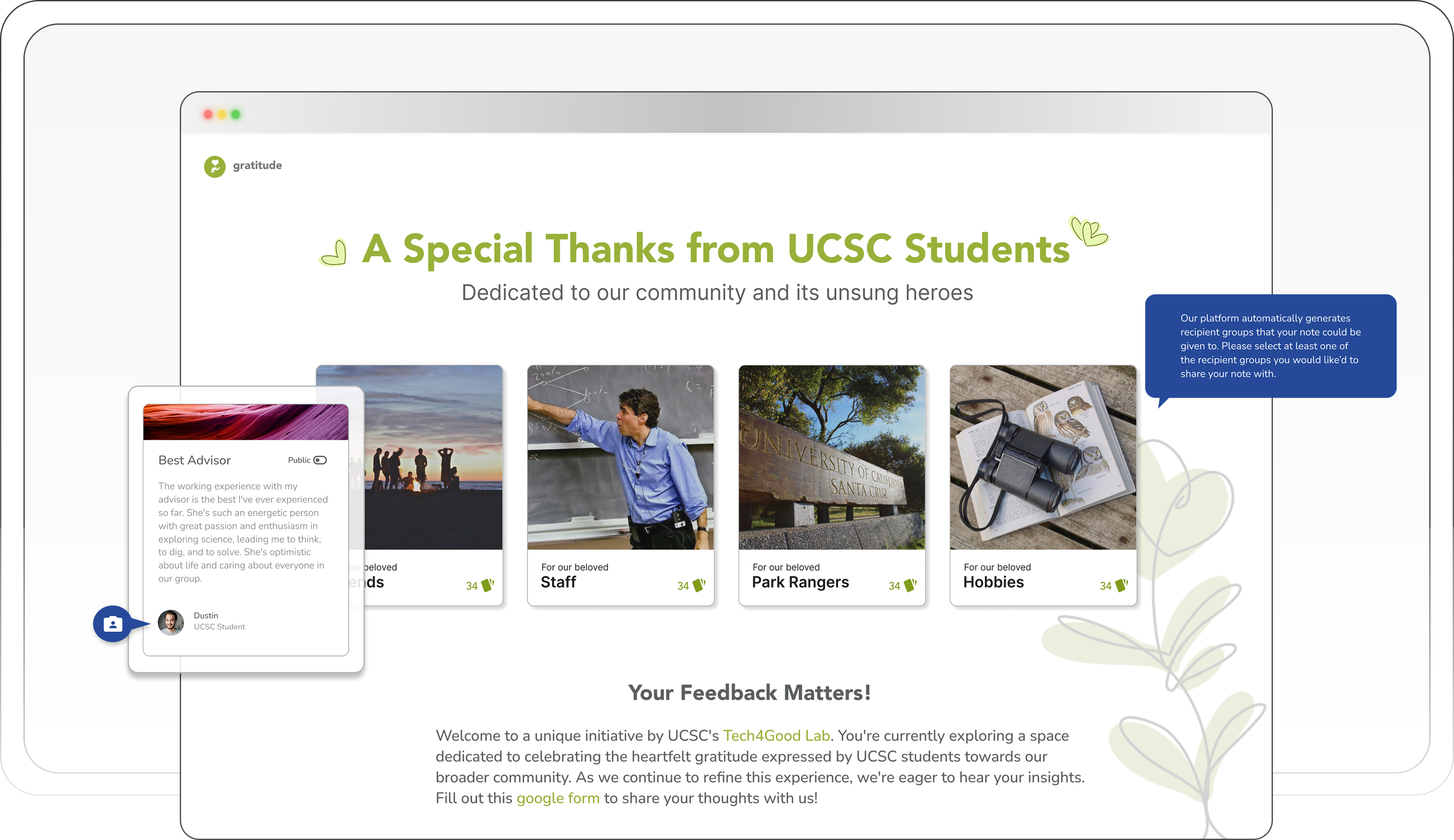
Overview
Following a research study revealing the discrepancies between online gratitude and user fears, I joined the Tech4Good Lab team to re-design the platform experience from the ground up.
I led the UI design for Gratitude V2, co-creating the visual system and shaping key features including the onboarding flow, AI-powered recipient tagging, and privacy controls.
The platform launched as a live site with hundreds of weekly visitors, and the underlying research was published in an ACM paper. In testing with a subset of 15 participants, 93% felt more comfortable sharing anonymously, and saw themselves continuing use of this platform long-term.
Context
The first version taught us that people loved the idea but feared the execution
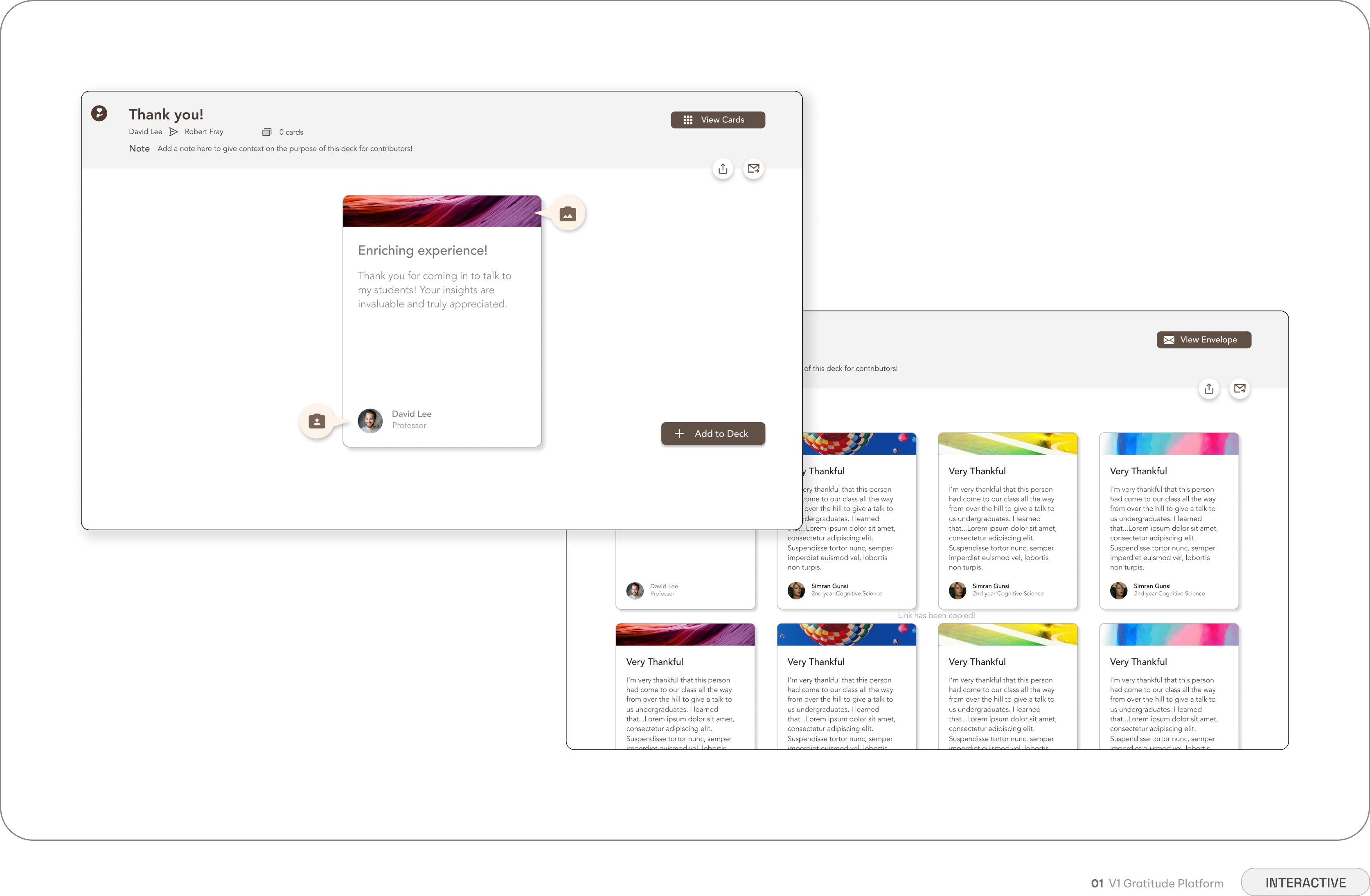
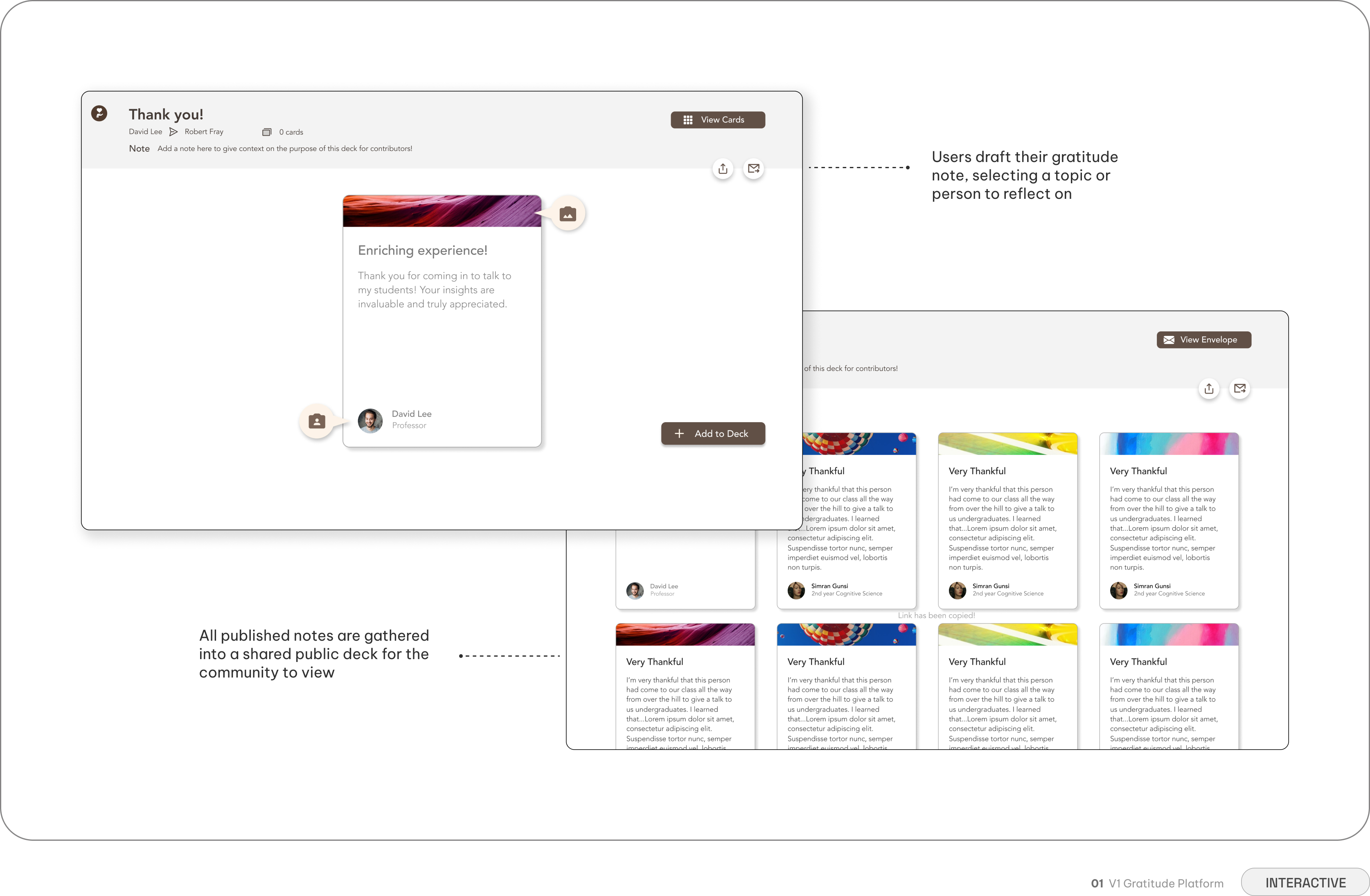
Before I joined the team, the Tech4Good Lab had already run a V1 study — an initial exploration into whether a digital gratitude-sharing platform could work. The V1 platform was intentionally simple: users could write gratitude notes and share them with a community. It was originally a bare-bones proof of concept, built to test whether the core idea was viable.
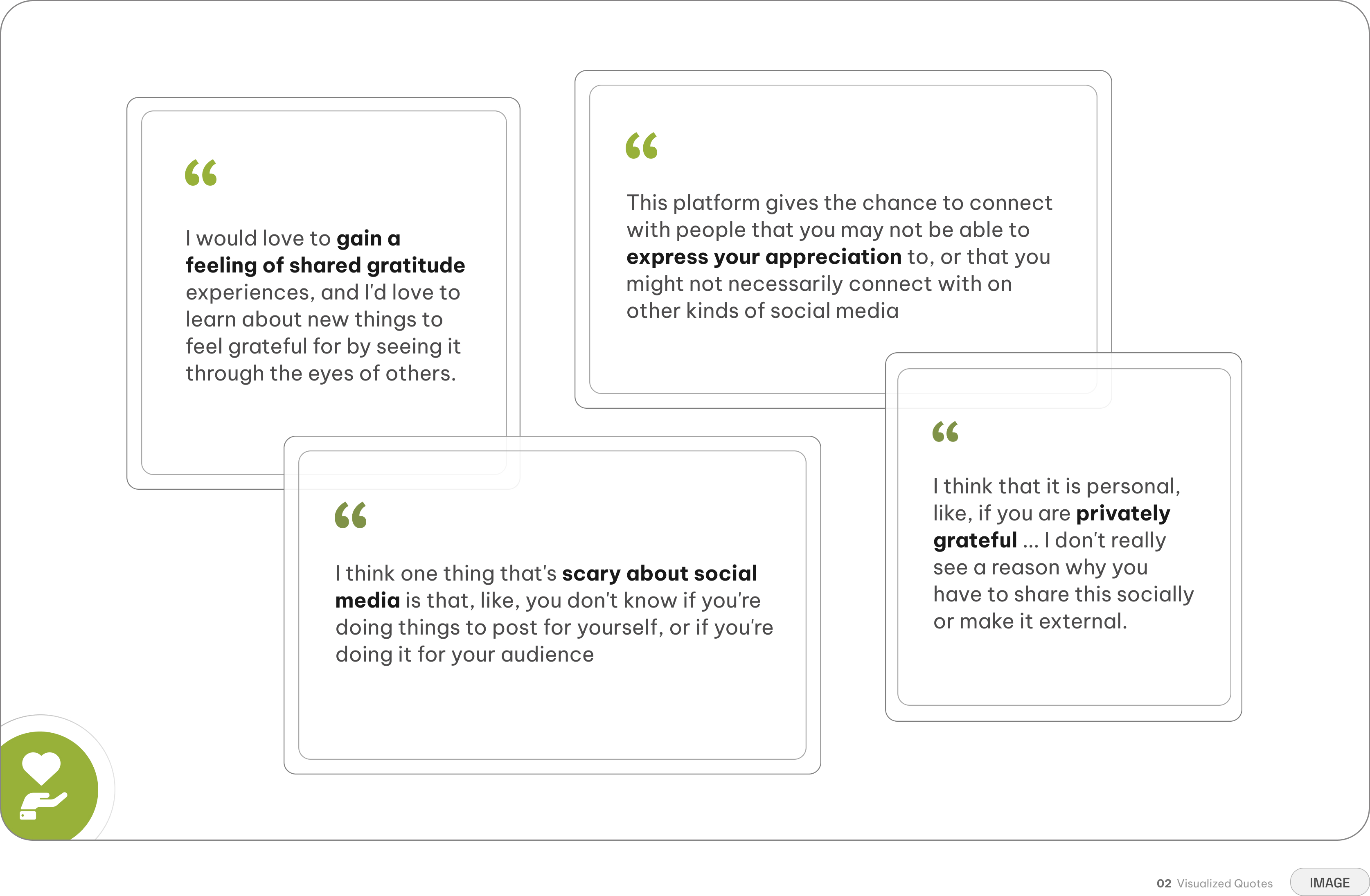
The V1 team gathered rich qualitative data from participants who used the platform, and the findings were full of contradictions. That tension — proven interest, broken execution — became our starting point. My team was tasked with V2: redesigning the platform from the ground up to keep the benefits while removing the fear.
The Problem
How do you design for genuinely sharing gratitude when people are afraid of being seen?
Participants wanted the benefits of communal gratitude, but the V1 design made them feel like they were posting for an audience rather than reflecting for themselves. There was no onboarding to explain the platform's purpose, no guidance for writing, no privacy controls, and no way to connect notes to the people who inspired them. The concept was promising, but the experience wasn't ready for real emotional investment.
Reduced stress after writing
95% of participants reported feeling calmer and more grounded after articulating gratitude
Appearing performative online
67% of participants worried their posts would read as self-congratulatory or insincere
Recalling positive memories
The act of writing brought back joyful memories participants had previously forgotten
Concerns about privacy
75% felt sharing personal gratitude was like exposing inner thoughts to judgment
Increased self-reflection
Writing helped users process their values and what mattered to them
Being misinterpreted
50% of participants feared readers might read tone wrong or assume ulterior motives
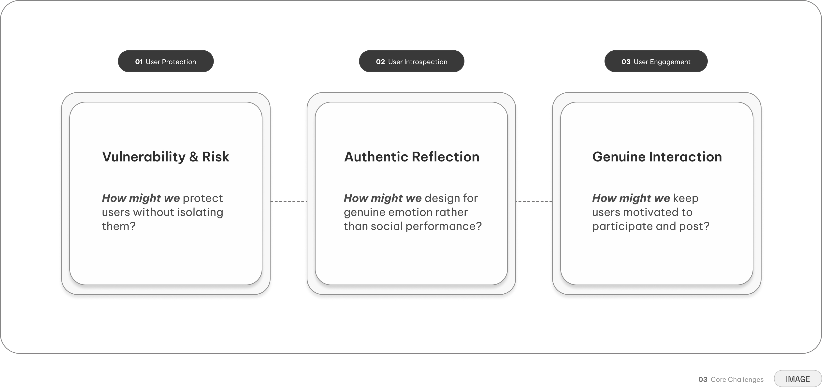
Our three core challenges and guiding questions
This gap — between what people wanted to feel and what the platform made them feel — became our design territory. We translated the V1 research into three questions that would guide every decision in V2.
Onboarding
First impressions are emotional — ours was built to welcome, not perform
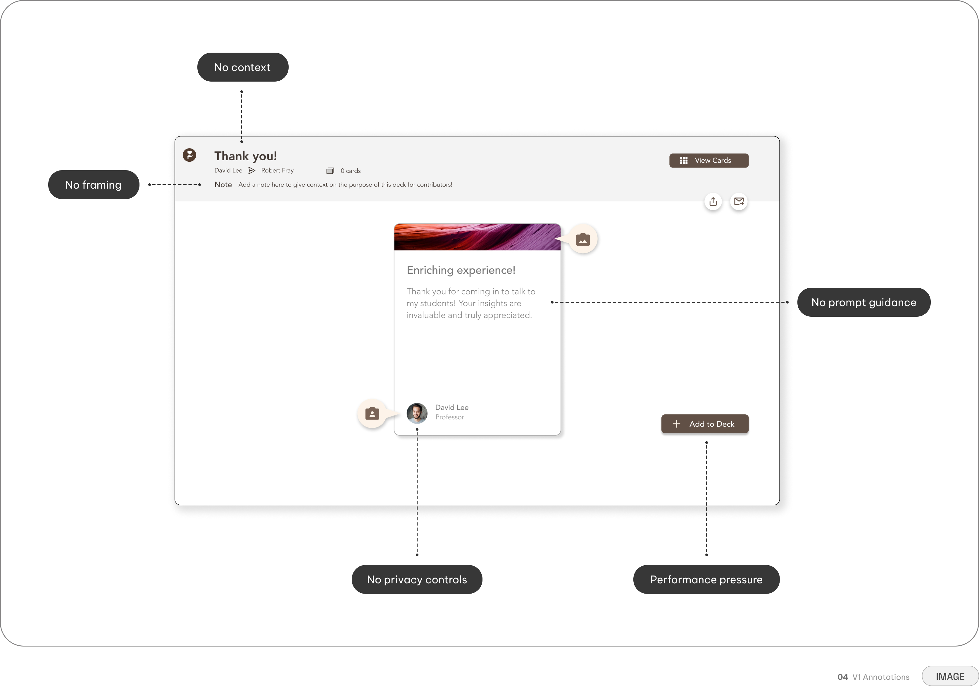
V1 dropped users onto a blank dashboard with no context. No explanation of why gratitude matters, no guidance on how to participate, no reassurance about what happens to their words. Users felt like they were performing for an audience before they even understood the platform's purpose.
The platform demanded vulnerability before earning trust
Fixing the underlying issues meant rethinking the entire entry experience. Every step in V1 assumed users were ready to be seen — input personal information immediately, browse public decks with full names attached, write with no guidance, post with no choice. None of those steps asked whether users felt safe enough to share. The platform demanded vulnerability before earning trust.
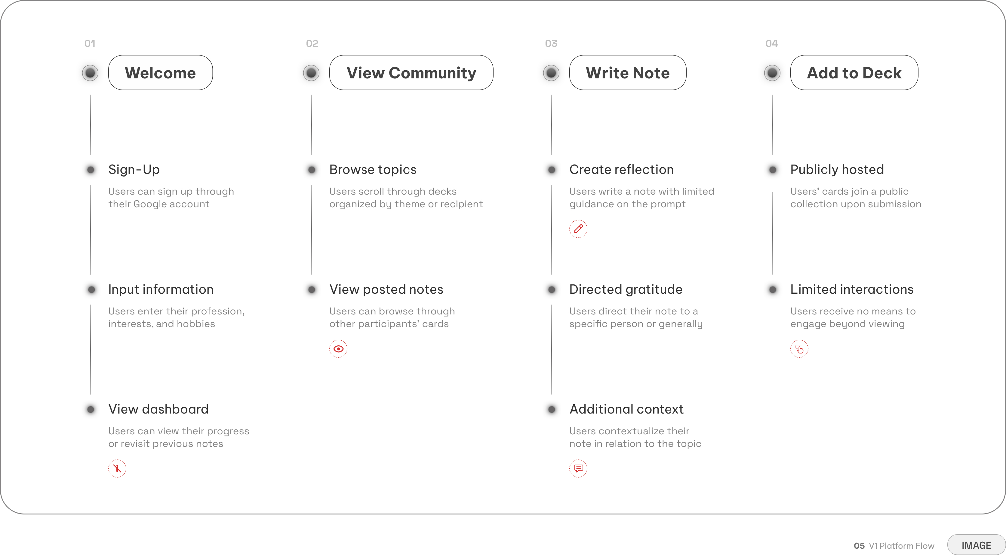
The V1 flow revealed five core friction points that created frustration in first-time users
No purpose or framing — Participants landed with no explanation of what the platform was
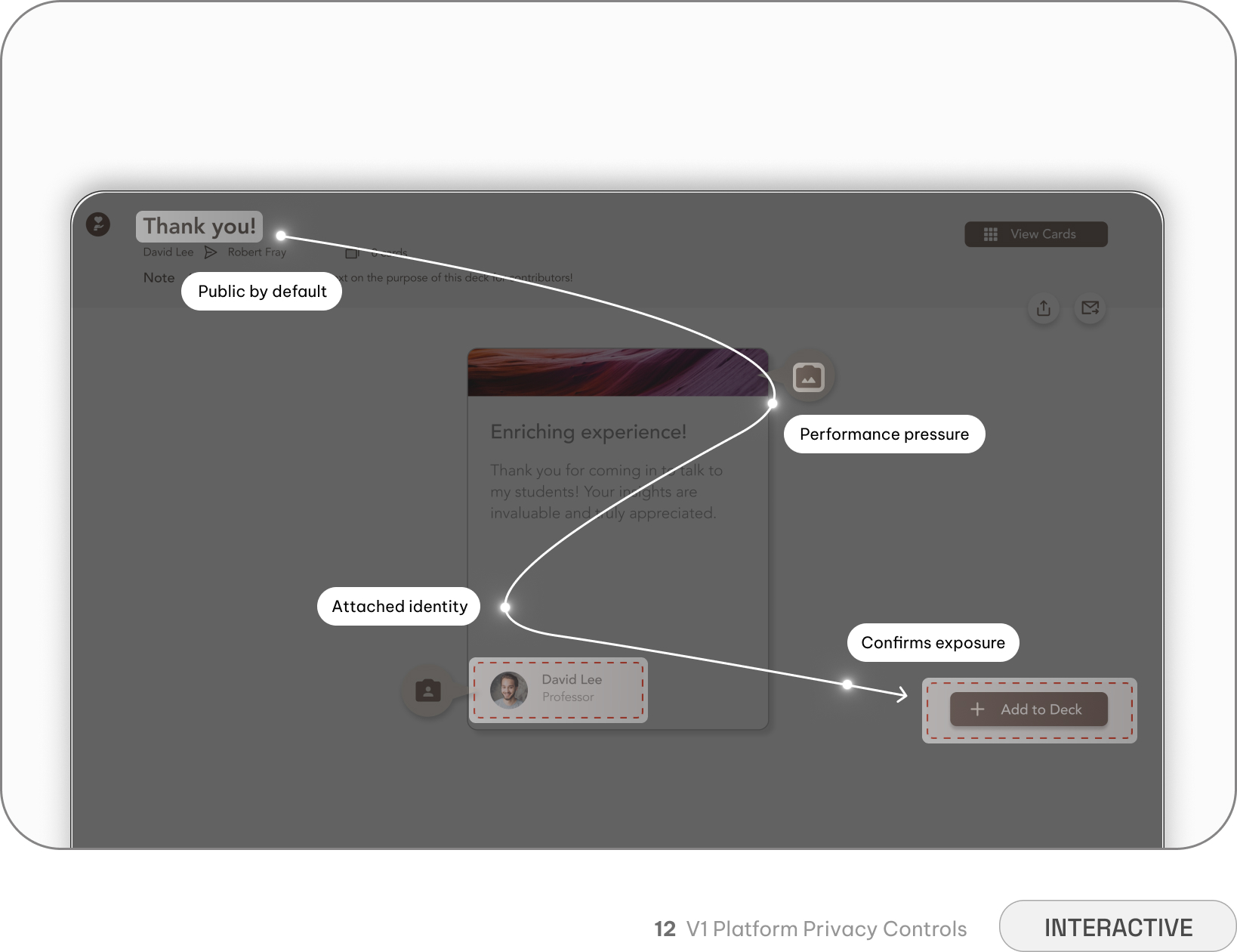
Public exposure by default — Full names and photos attached to every post created fear of judgment
Blank page paralysis — Unlimited freedom with no guidance led to confusion and limited participation
Burden of context — Users had to explain their note's purpose rather than the platform providing structure
One-way communication — No way to engage with others beyond posting; no reactions, no feedback loop
We rebuilt the entry around trust, not exposure
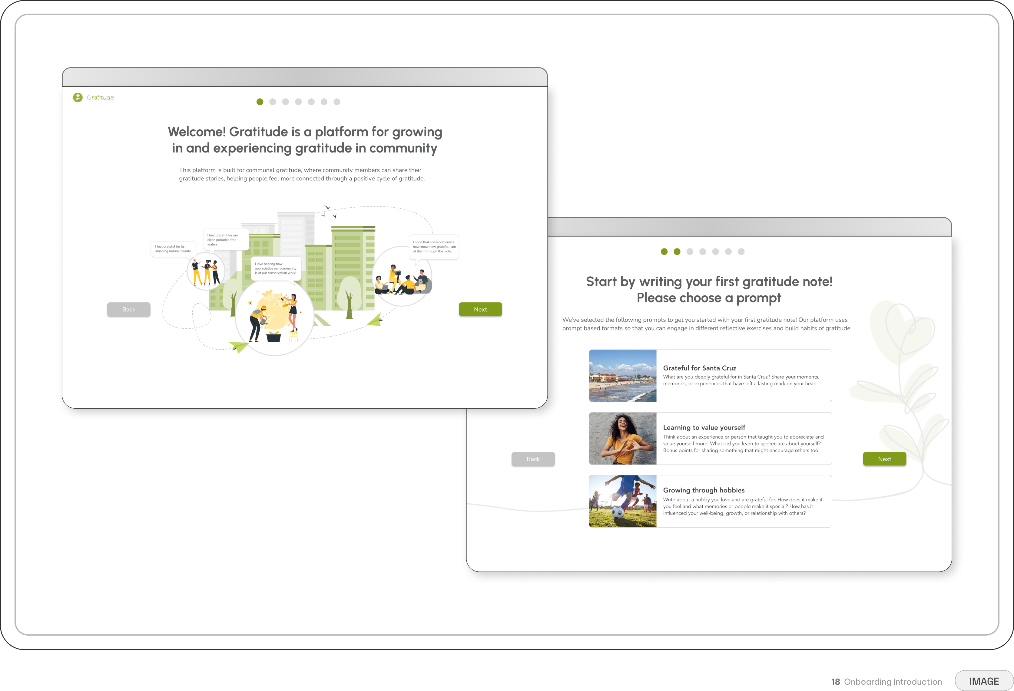
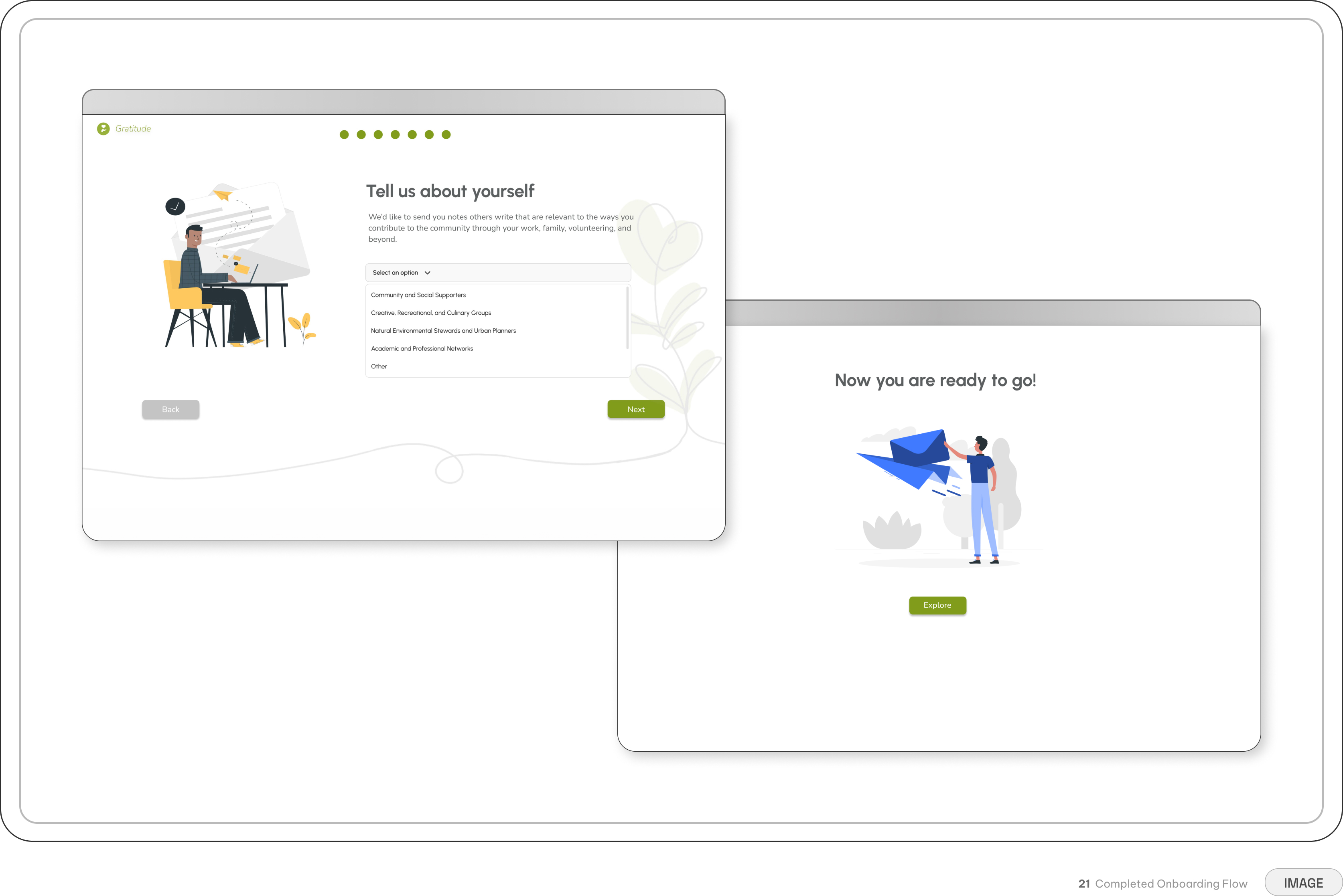
I designed the V2 onboarding as a guided walkthrough that introduces the gratitude cycle upfront. The goal was to build trust incrementally: explain what gratitude means on this platform, show how notes travel from writer to reader, and clarify what "anonymous" actually means before users ever start writing.
The V2 onboarding compresses the core experience into a safe first run. Users practice the full cycle once with training wheels, then move into the platform with confidence. But onboarding only sets the stage. The features that follow — prompts, AI tagging, privacy controls, streaks — are what make the platform usable long term.
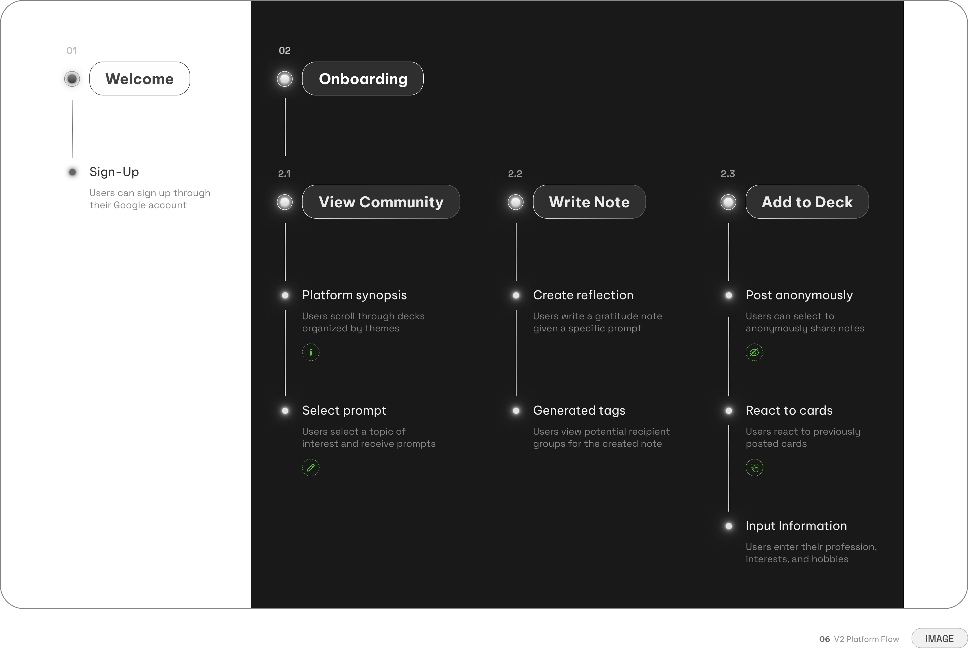
The onboarding process walks users through each core action once
Platform overview — Participants immediately understand the purpose of the platform
Visibility choice — Users decide whether to share anonymously or publicly before posting
Prompted reflection — Users choose from specific prompts around topics they care about
Community reactions — Users can engage with others' posts through emoji reactions, creating feedback
Key Features
Our platform is only as strong as the interactions it enables
With onboarding setting the emotional foundation, the rest of the platform needed to deliver on that promise. Each feature was designed to solve one of the three challenges we identified in V1: vulnerability, authenticity, or engagement.
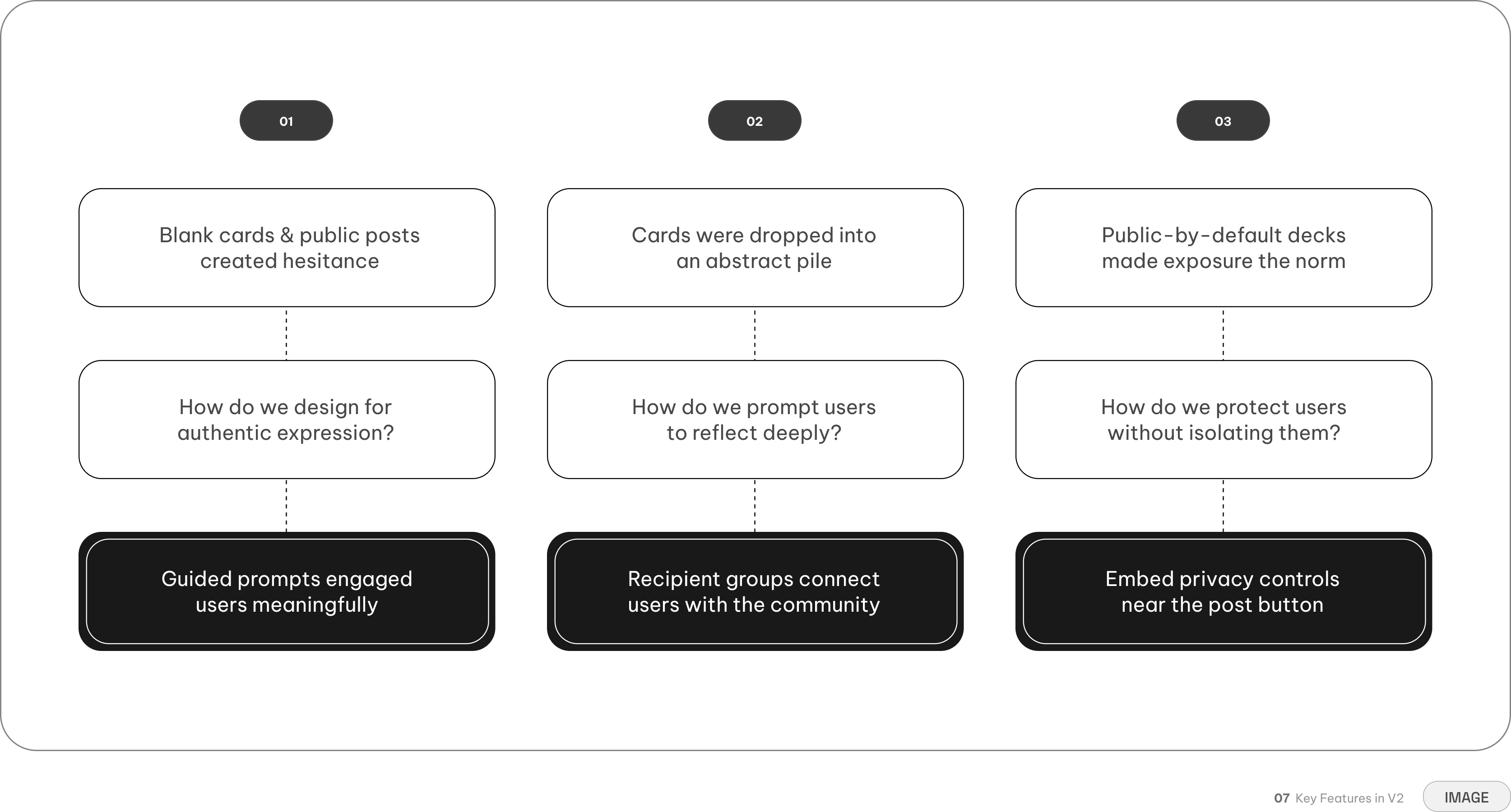
But first, we needed to re-design the gratitude note
If onboarding sets the emotional foundation, the note card is where users actually take the risk of sharing something personal. V1 treated the card as a simple container for text. That wasn't enough.
The card needed to make writing feel approachable while supporting the three mechanics that made V2 different: guided prompts, recipient connection, and privacy. We redesigned its architecture around those needs, turning the note from a blank content container into a structured space for reflection.
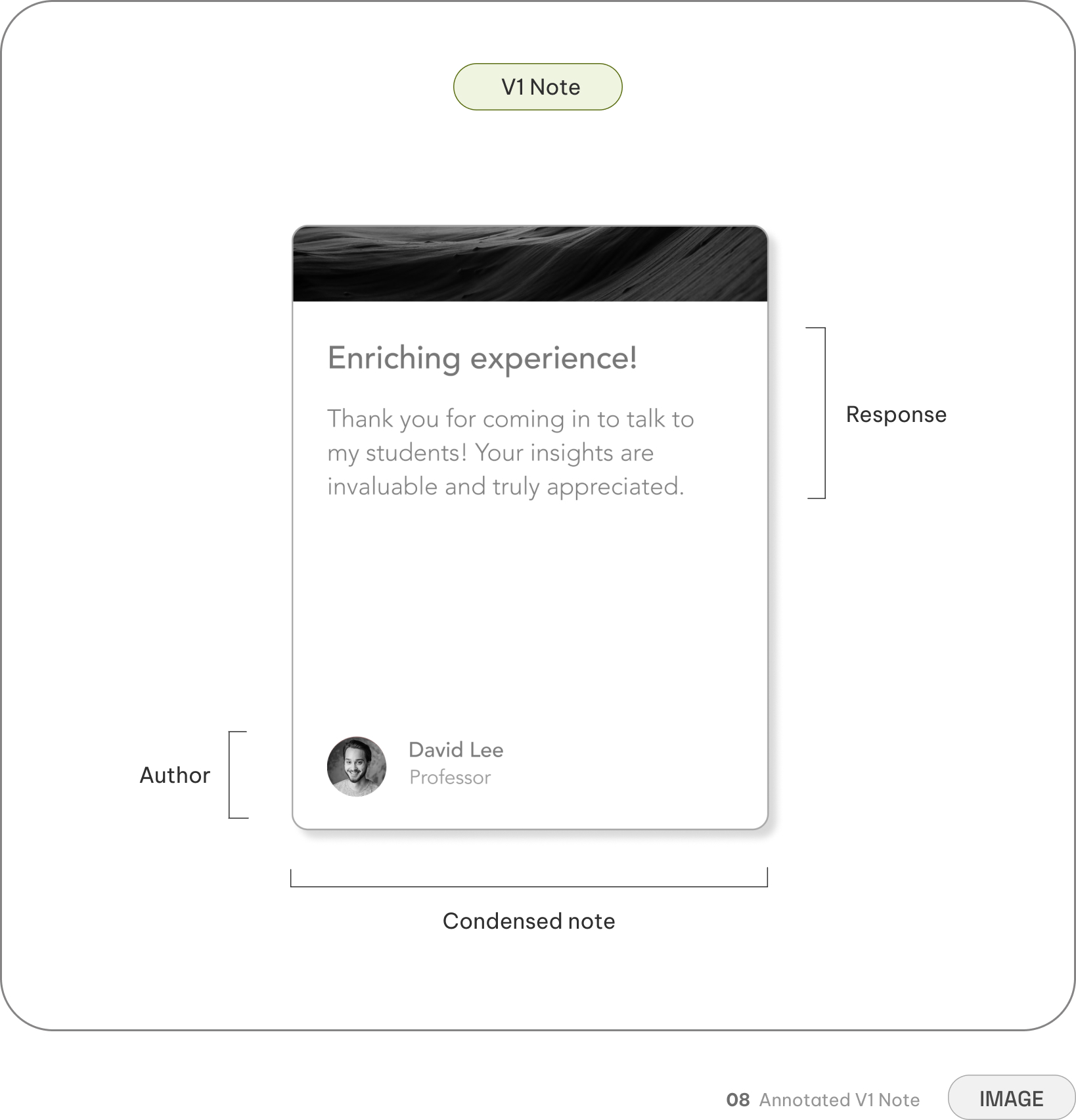
The compact, vertically stacked design is familiar and easy to scan quickly, reducing cognitive load
The author is more prominent than the content of the note, increasing performance anxiety
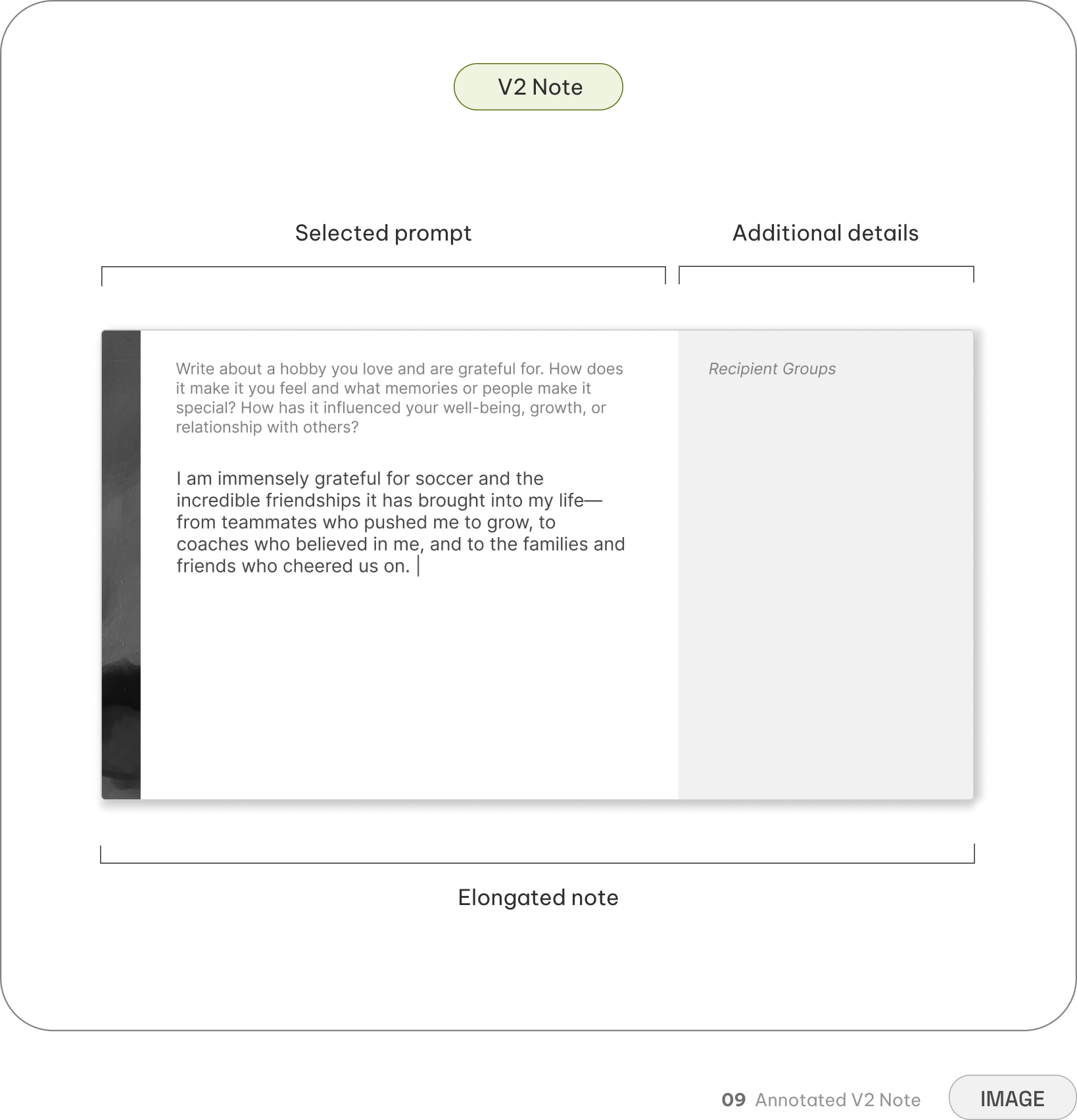
Incorporating the prompt directly into the writing experience decreases blank-page paralysis
The elongated format allows for community metadata to be separated from personal reflection
The elongated format used more horizontal space, creating challenges in scaling for smaller devices
From a blank page to guided reflection
V1 handed users a blank card and implied they were contributing to a public collection. Predictably, people froze or wrote thin, performative posts.
V2 replaces the blank page with curated prompts that lower the barrier without lowering the depth. Each prompt invites reflection while leaving room for personal meaning.
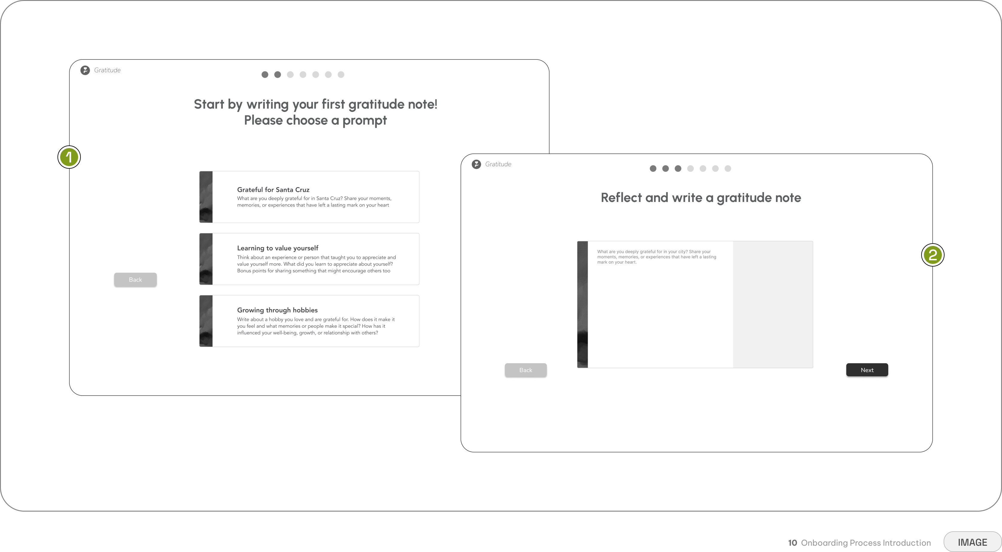
The nnboarding process shows each core action once to enable users to independently explore
Directing users through distinct categories before writing lowers cognitive load and sparks inspiration
The chosen prompt remains anchored at the top to guide writing, with navigation to easily swap topics
Expanding gratitude beyond the obvious
V1 cards floated into decks, but there was no mechanism connecting a writer's gratitude to the people who inspired it. The community aspect remained theoretical — you were adding to a pile, not reaching a person.
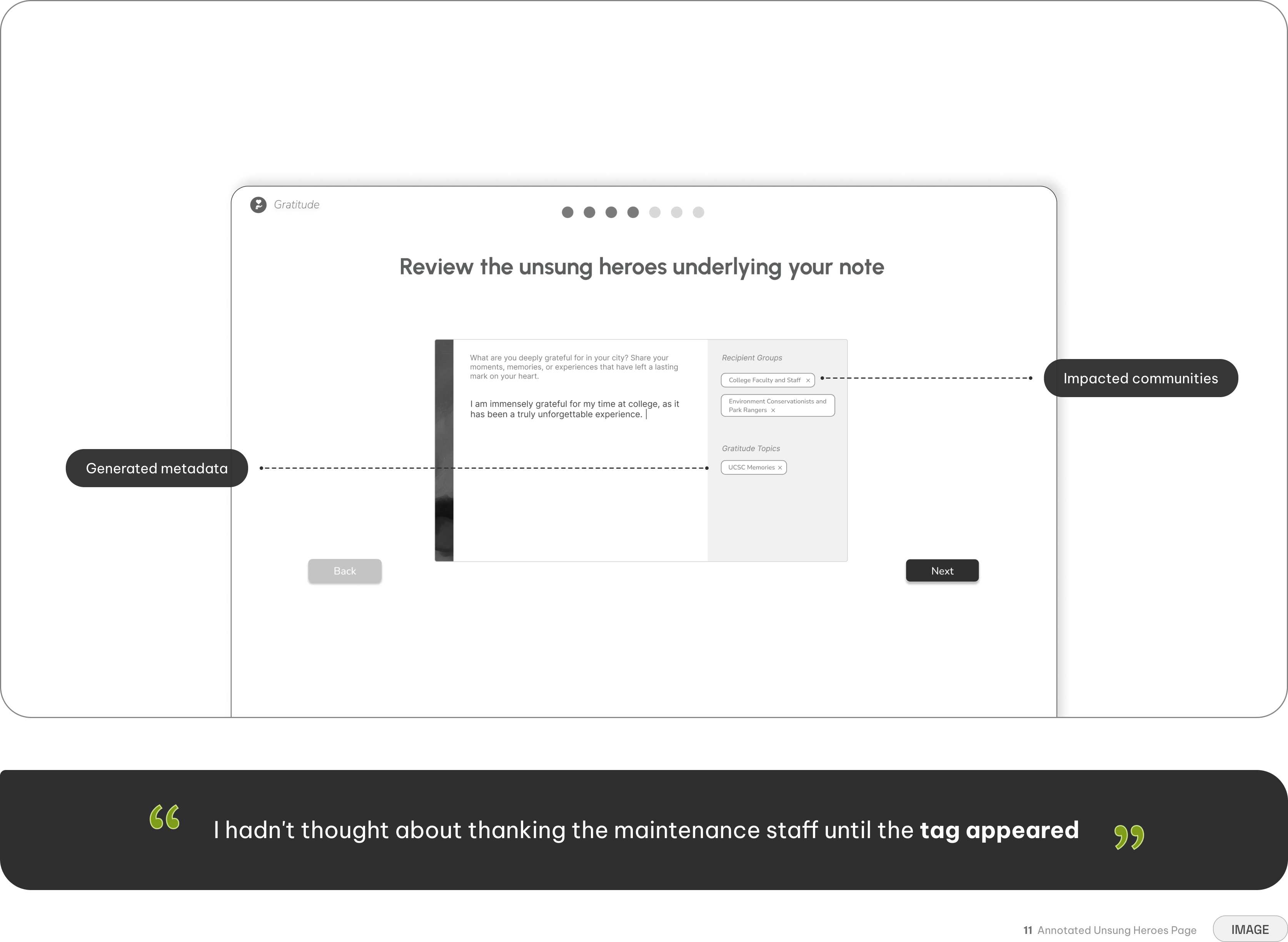
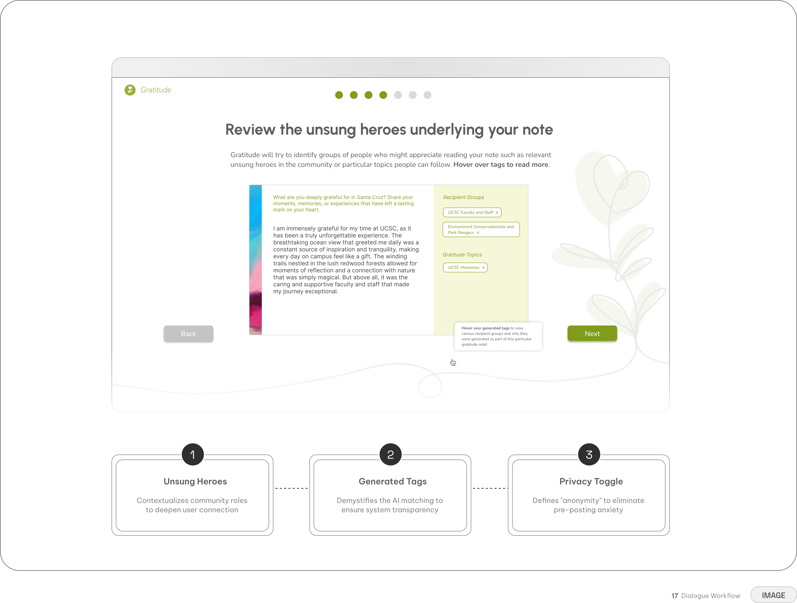
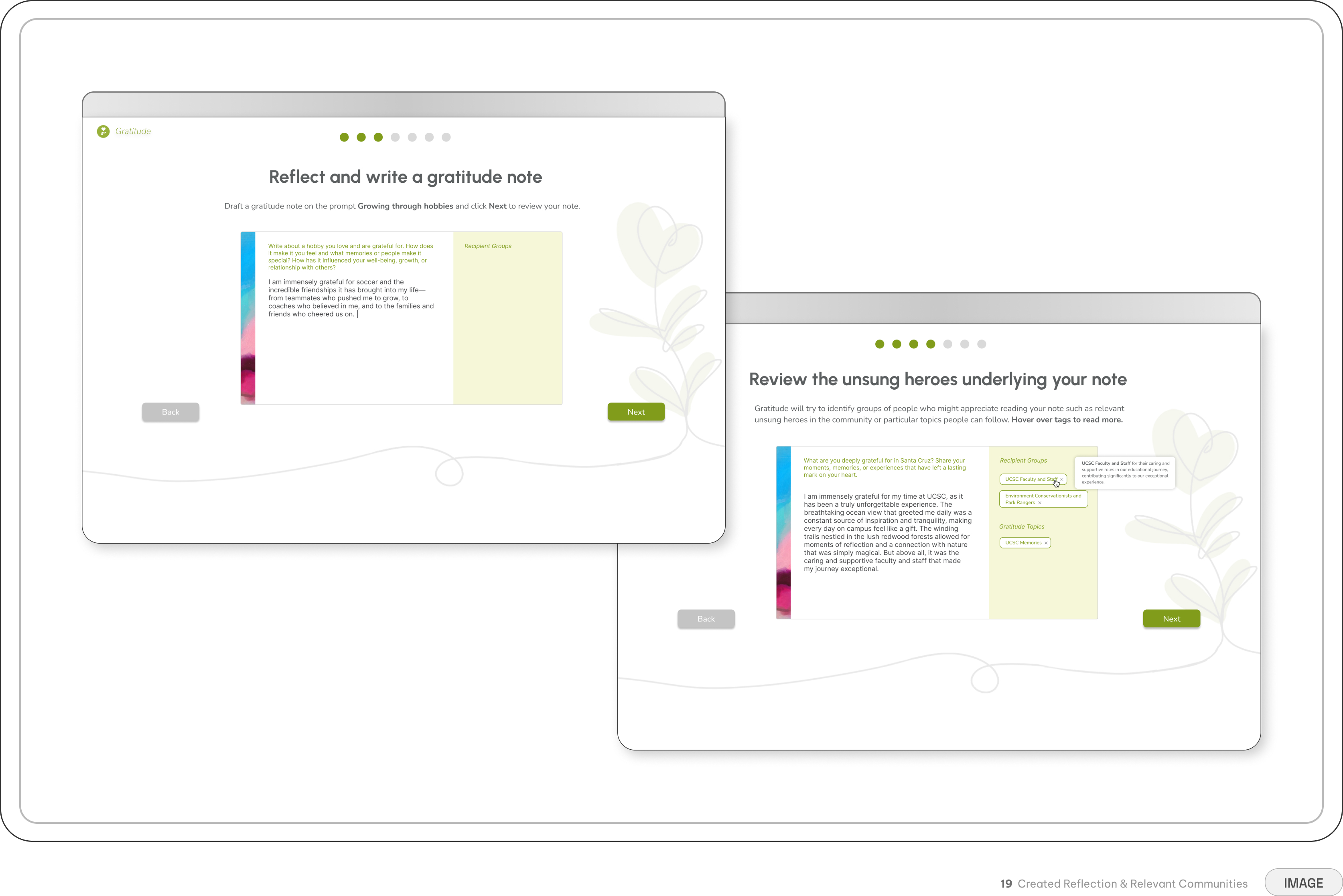
V2 integrates AI to surface implicit recipient groups as users write. Tags like "UCSC Faculty," "Park Rangers," and "Environmental Conservationists" connect individual reflections to the communities behind them. The AI doesn't replace the writer's words — it helps their gratitude travel further.
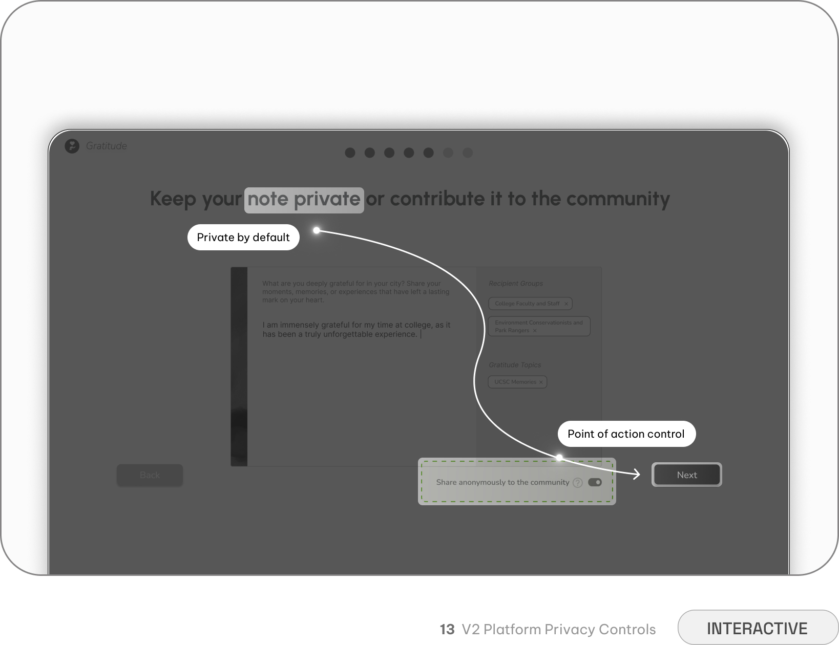
Safety as a feature, not an afterthought
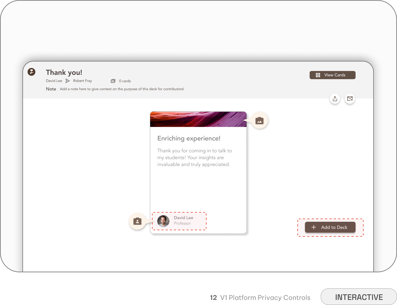
V1 made exposure the default. Cards were public, writers were identifiable, and the deck structure amplified judgment — your contribution sat alongside others, evaluated as a collection. The fear of being seen killed authenticity before it could start.
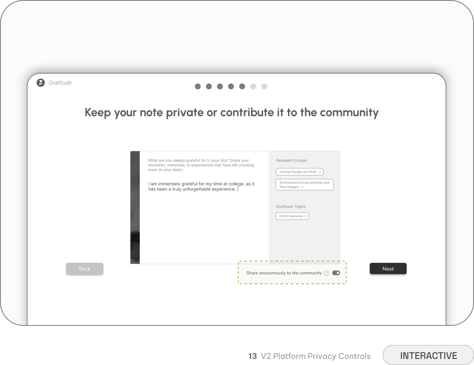
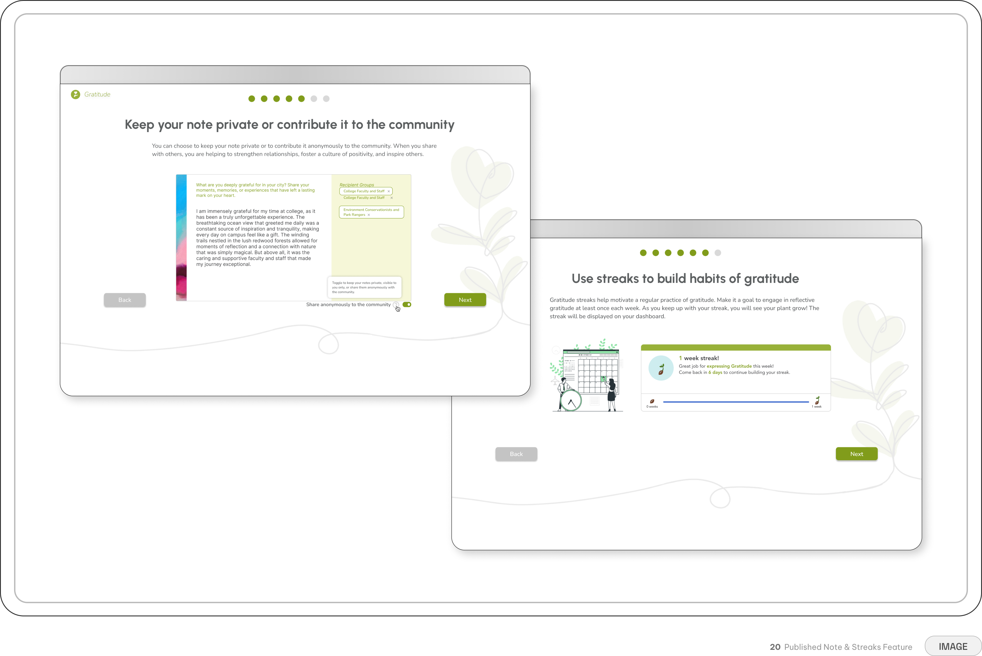
V2 places agency at the point of decision. The anonymous sharing toggle lives right beside the publish button — impossible to miss, impossible to misunderstand — and is opt-in rather than default. We iterated heavily on placement, styling, and tooltip copy because safety needed to feel as intentional as the writing itself.
Design System
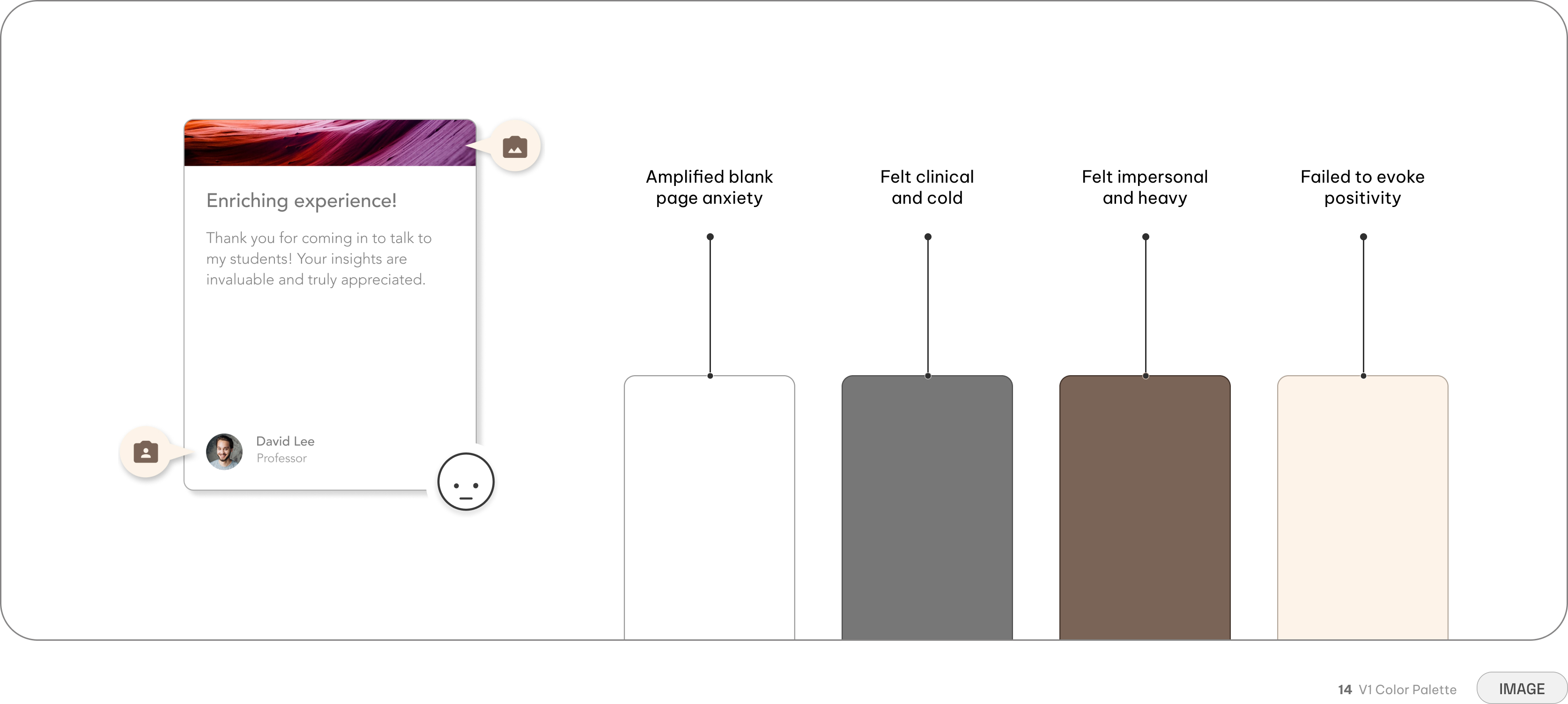
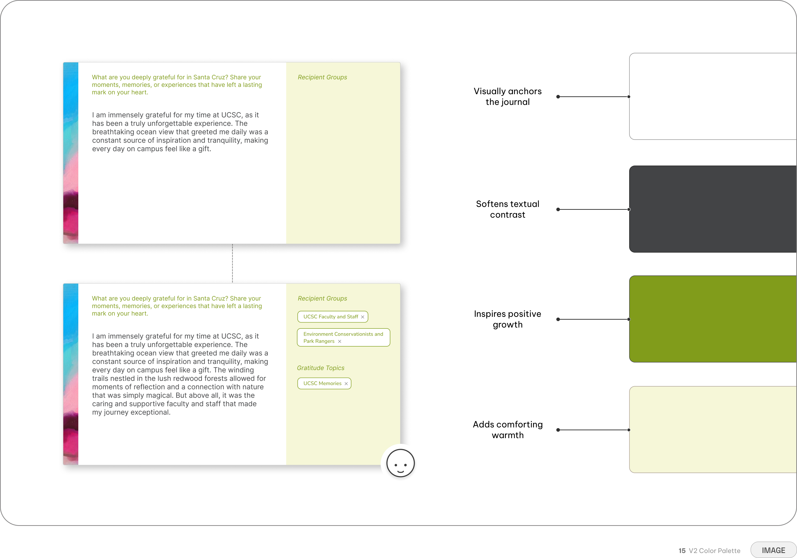
A visual system designed to feel warm and welcoming
The original brown palette gave Gratitude a warm, grounded quality. But as the platform grew, the interface needed more room to breathe.
The primary canvas remained white, but introduced green as the dominant accent across interactions and content. The warmth remained, but the lighter palette created more space between elements and clearer relationships between content, actions, and supporting information. The change wasn't a rebrand. It was an evolution — the same Gratitude, with a visual language better suited to where the platform was going.
Consistency made the complexity disappear
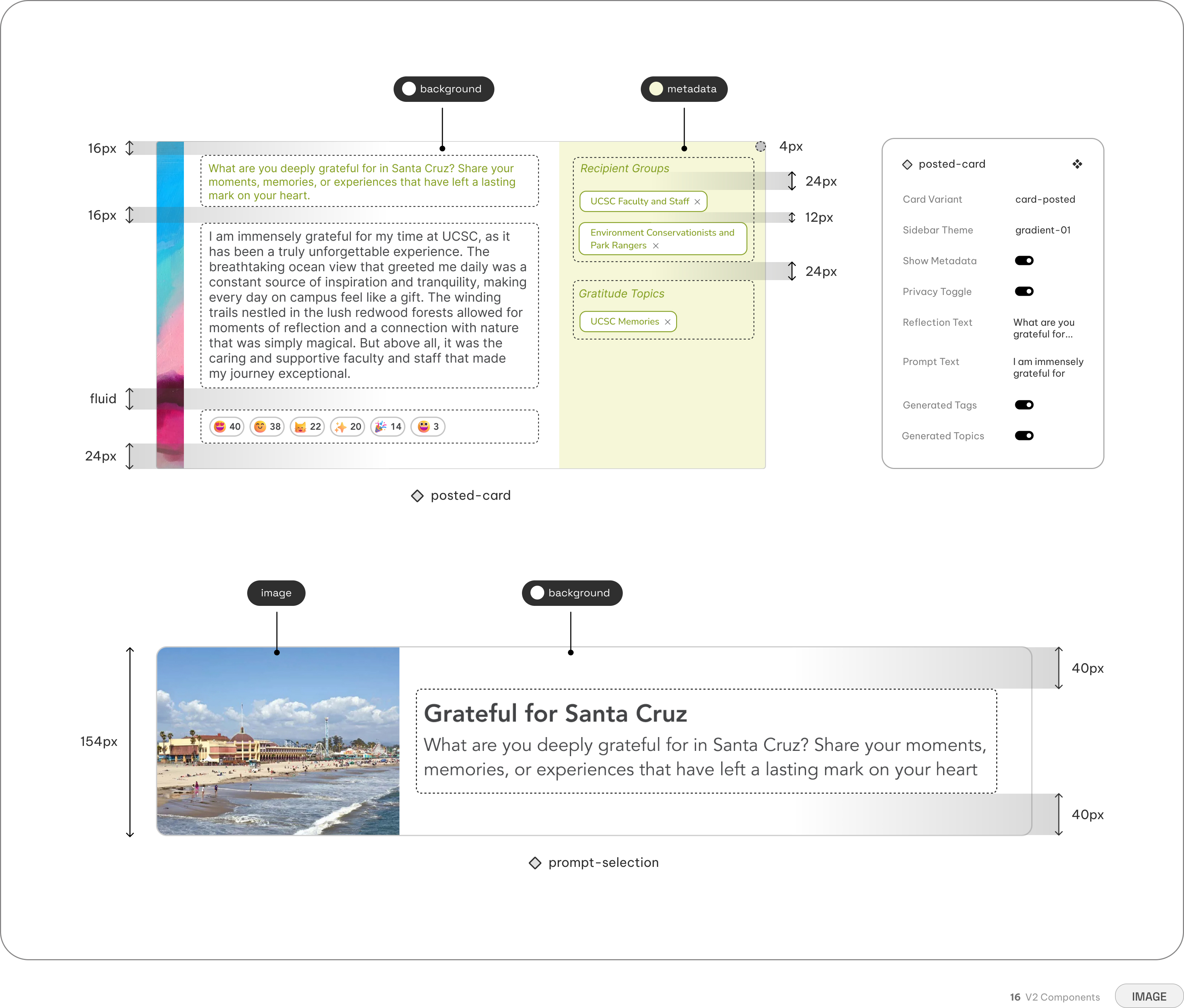
As the platform grew, so did the number of interactions. Cards, buttons, tags, inputs, toggles, prompts, and feedback states all needed to feel like parts of the same experience. I translated the visual language into a reusable component system so new features could build on the same foundation rather than introduce another visual pattern. Consistent spacing, hierarchy, and interaction states kept the experience approachable even as we introduced AI-generated recipient groups and privacy controls.
Providing more context through dialogue
A calming visual system could only go so far. At high-friction moments, users still needed to know what would happen when they clicked, shared, or changed a privacy setting.
We introduced contextual tooltips and microcopy at these moments to answer those questions in place. Instead of adding another layer of instructions, the interface provides clarity exactly when uncertainty appears — helping users move forward without breaking the flow.
The system in practice
The final system had to work across every part of the experience — onboarding, writing, sharing, and community discovery — without making the interface feel overwhelming. Each interaction has enough structure to guide users without competing with what matters most: the gratitude itself.
The result was a visual system that made a growing set of features feel like one experience. The palette, components, and hierarchy work together to give Gratitude a consistent identity from the first screen to the final note.
Retrospective
Did the design actually change how users felt?
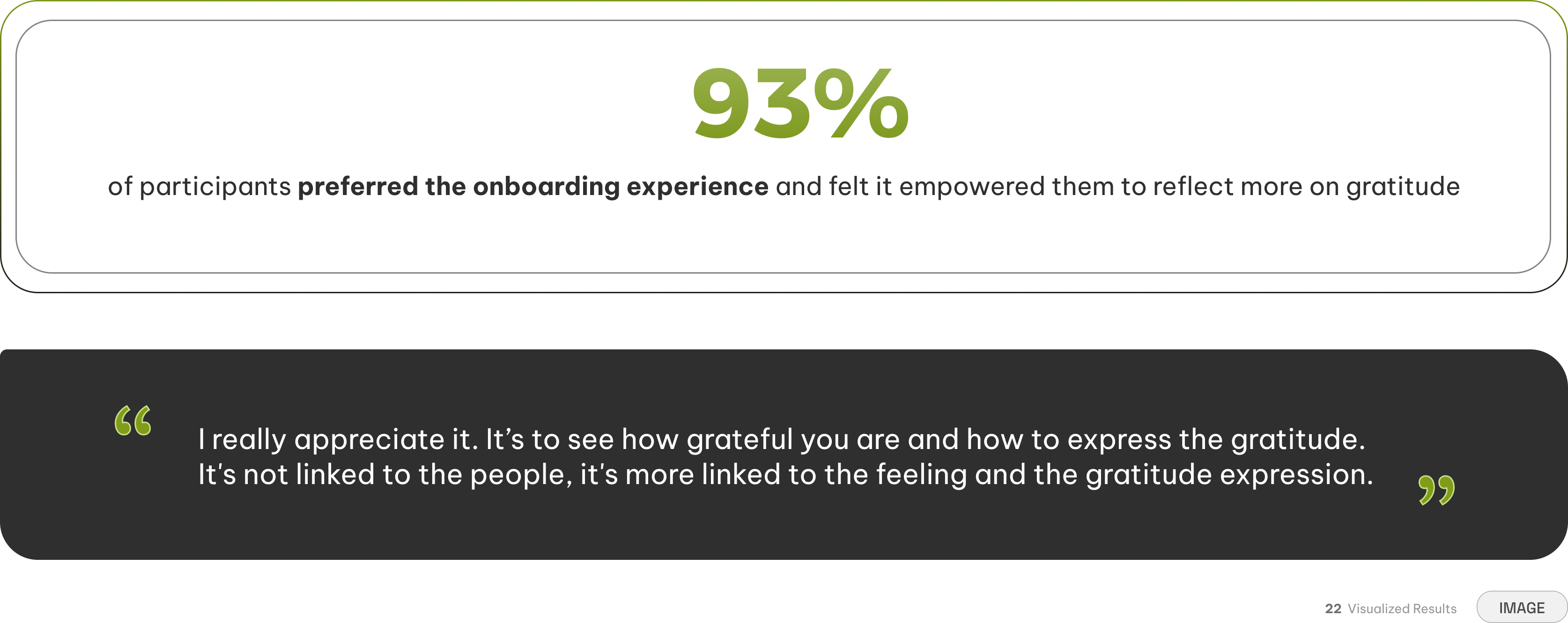
Following the launch, our team conducted formal interviews with 15 participants to evaluate the new platform experience. The results reinforced our central hypothesis: the architecture of an interface can shape how safe people feel using it.
After using V2, all participants reported feeling more comfortable sharing gratitude. They pointed to the anonymous environment and inspiration from other people's notes as key factors. AI-generated recipient tags also helped create a stronger sense of connection, with users describing how seeing their communities highlighted made them feel seen and valued.
The new tradeoff: the anonymity paradox
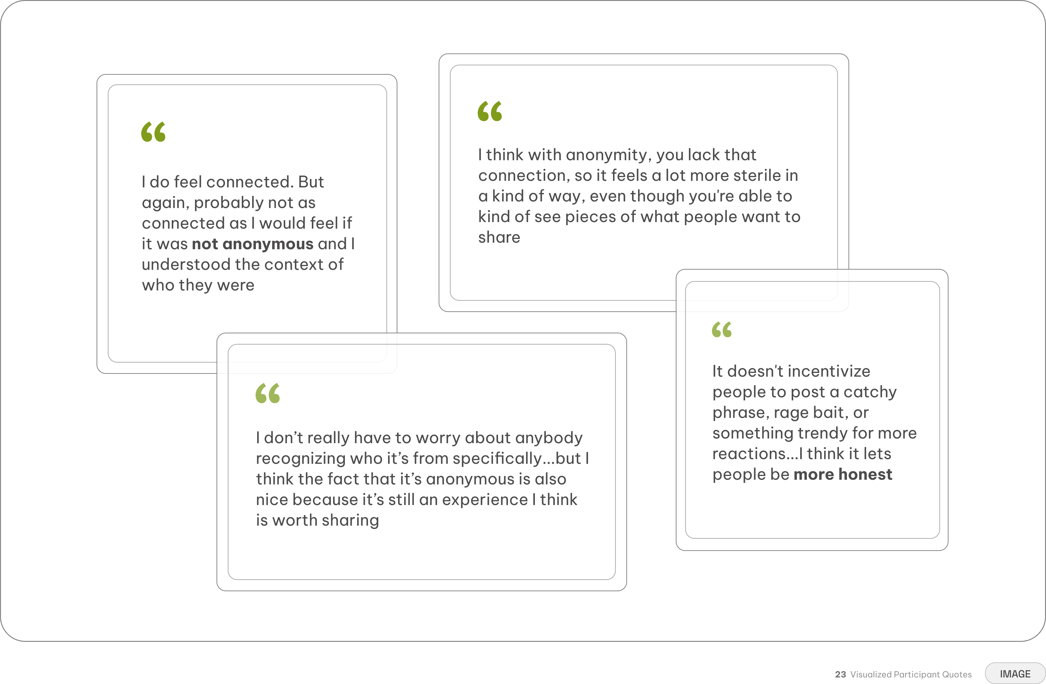
Anonymity solved one of V1's biggest barriers: the fear of being seen. But once names and faces disappeared, something else disappeared with them. Some participants found the reading experience less personal without human context, describing it as slightly "sterile."
The same anonymity that gave writers the confidence to share could make it harder for readers to connect with the person behind the reflection. The lesson wasn't that anonymity was wrong. It was that psychological safety and human connection aren't opposing problems — they have to be designed together.
My key takeaways
Building Gratitude changed how I think about the relationship between interface and emotion. A button isn't just a button when it controls whether someone feels safe sharing something personal. A card isn't just a container when it determines how someone approaches reflection. The biggest lesson I took from V2 is simple: good product design doesn't just support what people do. It shapes how they feel while doing it.
A feature is a tradeoff, not a cure-all
While removing identity provided the necessary safety to write authentically, it stripped away the interpersonal context required to deeply connect
AI should augment instead of author
Leveraging generative AI strictly to process background metadata expanded the community's reach without overriding the user's genuine voice
Intentional friction can reduce cognitive load
Adding a multi-step flow to curate prompts required more clicks, but it successfully cured blank-page paralysis and built user confidence
Simplicity is key to the user experience
Stripping away complex social mechanics like public feeds transformed a public platform into a focused space for personal reflection
